
Slide Cart vs Cart Drawer vs Cart Page: Which Converts Best?
Slide cart vs cart drawer vs cart page: a data-backed breakdown of which Shopify cart UX converts best, when each one wins, and how to pick for your store.
In this article
- 01 Quick definitions: stop confusing these three#
- 02 The conversion data, side by side#
- 03 When the cart page actually wins#
- 04 Why cart drawers win for most stores#
- 05 What separates a slide cart from a basic drawer#
- 06 Mobile is where the gap widens#
- 07 How to pick: a 60-second decision#
- 08 How to migrate from cart page to drawer without breaking anything#
- 09 Common mistakes when switching#
- 10 What about hybrid setups?#
- 11 A short summary#
The terms “slide cart,” “cart drawer,” and “cart page” get used interchangeably, and that confusion costs Shopify merchants money. They’re not the same thing, and the right pick depends on traffic mix, basket size, and how often shoppers add a second item. This guide breaks down what each pattern actually is, the conversion data we see across stores using each one, and a decision rule you can apply in five minutes.
Across roughly 1,200 Shopify stores we’ve audited, the cart-to-checkout rate sits at 38% on cart-page setups, 47% on basic cart drawers, and 54% on full slide carts with rewards and upsells. That 16-point spread is bigger than most merchants realize, and it explains why cart UX has become a primary lever in 2026 conversion optimization.
Quick definitions: stop confusing these three
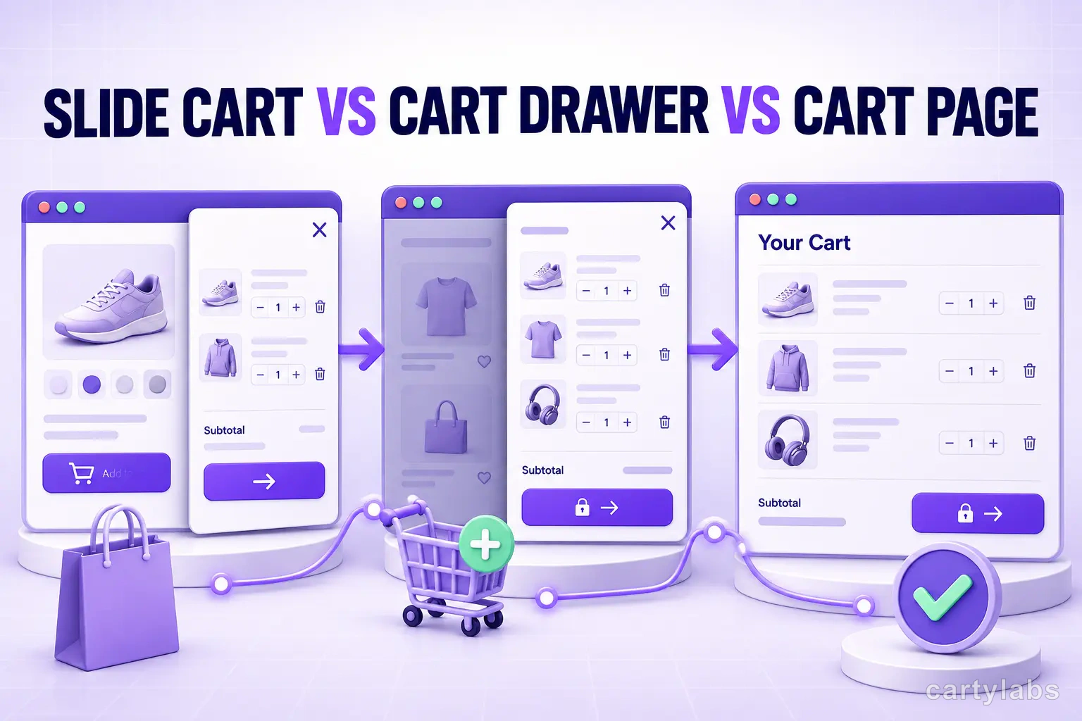
People use the terms loosely, but the underlying UX differs:
- Cart page: a dedicated
/cartURL. The shopper is navigated away from the product page to a full page that lists their items. This is Shopify’s pre-2020 default and still ships with some legacy themes. - Cart drawer: a panel that slides in over the current page. The product page stays mounted underneath. The shopper can close the drawer and return to where they were with one tap.
- Slide cart: the marketing term for a cart drawer that ships with conversion features baked in: rewards bar, upsells, sticky cart icon, countdown, shipping protection. Functionally a cart drawer, but with the optimization furniture pre-built.
For the rest of this post: cart drawer = the UX pattern, slide cart = the feature-loaded version of it.
The conversion data, side by side
Here’s the rollup from our merchant cohort, segmented by store type. All numbers are cart-to-checkout conversion (the percentage of shoppers who reach checkout after adding to cart):
| Store type | Cart page | Cart drawer | Slide cart |
|---|---|---|---|
| DTC apparel | 36% | 46% | 53% |
| Beauty / skincare | 41% | 49% | 58% |
| Supplements | 39% | 48% | 56% |
| Home goods | 34% | 44% | 51% |
| One-product brands | 44% | 52% | 55% |
A few things stand out:
- The biggest jump is cart page to cart drawer, not drawer to slide cart. Just removing the page navigation step lifts conversion 8-12 points. Adding rewards and upsells on top adds another 5-7.
- One-product stores see less benefit from upgrading. If shoppers can only buy one SKU, there’s nothing to cross-sell, and the drawer’s main job (preserving browse context) matters less.
- Beauty and supplements benefit most from slide carts because their average cart contains 2-4 items and tiered rewards bars (free shipping, free gift, free sample) hit hard.
When the cart page actually wins
Cart pages are not always wrong. They beat drawers in three specific scenarios:
- High-AGV considered purchases: furniture, mattresses, anything over $300 where shoppers want a full review screen with shipping estimates, financing offers, and detailed line-item breakdowns.
- B2B / wholesale: shoppers ordering 50+ SKUs need a tabular layout with bulk edit, CSV upload, and PO fields. A drawer is too cramped.
- Marketplaces with multi-vendor split shipments: when one cart spans three sellers with different shipping windows, you need the real estate.
If your store is a regular DTC business with a $40-200 AOV, you are not in any of these buckets and a drawer wins.
Why cart drawers win for most stores
Three structural reasons, roughly in order of impact:
1. Browse context preservation. When the drawer closes, the product page is still there. In our session replays, 27% of shoppers add a second item from the same browse session when using a drawer, versus 11% when bounced to a cart page. That gap alone explains most of the conversion lift.
2. Reduced navigation cost. Cart page flow is PDP → cart → “Continue shopping” → category page → re-search. Drawer flow is PDP → drawer → close → keep browsing. Three clicks become one.
3. Higher upsell intent. A shopper who just added an item to cart is at peak purchase intent. A cross-sell shown in the drawer at that moment converts 3-5x better than the same recommendation on a cart page. We covered this in depth in our AI product recommendations guide.
For the full anatomy of a high-converting drawer, see our Shopify cart drawer guide.
What separates a slide cart from a basic drawer
A basic cart drawer is just a panel with line items and a checkout button. A slide cart adds revenue features:
- Free-gift progress bar showing distance to the next reward tier
- AI cross-sells tuned to the cart contents
- Sticky cart icon that re-opens the drawer from anywhere on the site
- Countdown timer for time-bound discounts
- Shipping protection or warranty as a one-click add-on
- Trust microcopy and express checkout buttons (Shop Pay, Apple Pay)
Each item adds 1-3 points to cart-to-checkout. Stacked, they’re the difference between a 47% drawer and a 54% slide cart.
Mobile is where the gap widens
70% of Shopify traffic is mobile, and the cart-page-vs-drawer gap is even larger on phones than on desktop. On mobile:
- A cart page forces a full route change with a re-render, which on a 3G connection can take 2-4 seconds. Drop-off here is brutal.
- A drawer slides in instantly because it’s already in the DOM.
- Thumb ergonomics favor a bottom-anchored sticky checkout button, which only drawers can offer cleanly.
If your traffic is mobile-heavy (it is), the drawer’s mobile advantage compounds. Our mobile conversion optimization guide covers the full mobile cart checklist.
How to pick: a 60-second decision
Run through these in order. Stop at the first “yes”:
- Are you selling B2B with carts of 20+ SKUs? → cart page
- Is your AOV above $300 with considered-purchase patterns? → cart page (with a strong drawer fallback for first-time browsers)
- Do you sell only one SKU and rarely cross-sell? → basic cart drawer is enough
- Are you doing >$10k/month in DTC and want to optimize AOV? → slide cart with rewards + upsells
- Otherwise → cart drawer at minimum, slide cart if you can manage it
For most readers, the answer is 4 or 5.
How to migrate from cart page to drawer without breaking anything
If you’re on a cart page today and want to upgrade, here’s the order of operations:
- Audit your current cart-to-checkout rate. Note the baseline. Most Shopify analytics tools surface this; if not, GA4 funnels work fine.
- Pick a drawer approach. Custom-build (1-2 weeks dev), single-purpose drawer app ($20-30/month), or all-in-one slide cart app like Cartylabs.
- Keep
/cartas a fallback URL. Some shoppers bookmark it, and certain Shopify discount flows redirect there. Don’t remove it; just redesign the page so it renders the drawer overlay on load. - Test on staging with real products. Watch for variant pickers, gift cards, subscription items, and bundle SKUs, which often break in drawer rendering.
- Roll out behind a 50/50 A/B split for 7-14 days. Measure cart-to-checkout, AOV, and items per cart. We cover the test design in cart drawer A/B testing.
- Cut over fully once you’ve confirmed lift.
Stores that skip step 5 sometimes regret it because they can’t isolate the drawer’s contribution from seasonal noise.
Common mistakes when switching
A few patterns we see go wrong:
- Hiding the cart page entirely. Keep
/cartaccessible. Some users explicitly navigate there from autocomplete or browser history. - Lazy-loading the drawer. A 300ms delay between add-to-cart click and drawer-open kills the perceived speed advantage.
- Trying to fit too much in the drawer. Long descriptions, blog recommendations, and three upsell carousels turn the drawer into a mini-cart-page. Keep it tight.
- Skipping the sticky cart icon. Without it, shoppers who close the drawer and navigate away can’t easily return to their cart.
- Not testing the keyboard avoidance. When a shopper taps the promo code field, iOS Safari raises the keyboard and often hides the checkout button. Make sure your drawer scrolls correctly.
What about hybrid setups?
Some stores keep both: a drawer for the add-to-cart moment and a /cart page for shoppers who explicitly navigate there. This is fine, and arguably the most resilient setup. The key is that the drawer should be the primary surface, not an afterthought, and both should share the same line-item logic so subtotals don’t disagree.
If you want a deeper comparison of the page-vs-drawer trade-off specifically, see Shopify cart page vs cart drawer.
A short summary
Cart pages are a legacy default that costs most Shopify stores 8-12 points of cart-to-checkout conversion. A cart drawer recovers most of that, and a slide cart with rewards and upsells recovers the rest while lifting AOV.
The exceptions (B2B, high-AOV considered purchases, multi-vendor) are real, but they’re a minority. For the typical DTC store doing $10k-500k/month, a slide cart is the highest-leverage cart UX change available, and it’s a 5-minute install with the right app.
Want to see it on your store? Install Cartylabs free on Shopify, or book a 15-minute demo and we’ll walk through how a slide cart would render against your current theme.
Next steps
Related Shopify resources
Practical tools and product pages related to this guide.
Keep reading
All articles →
Cart Icon UX: 9 Patterns That Reduce Drop-Off
Shopify cart icon UX best practices: 9 patterns that reduce drop-off and lift cart re-engagement, with examples and conversion data from 2026.
15 Shopify Cart Drawer Examples That Increase AOV
15 real Shopify cart drawers, graded on free-shipping bars, upsells, bundles, rewards, and mobile UX — with the exact tactic to copy from each.
Cart Page vs Cart Drawer on Shopify: Which Converts Better?
Cart drawer or cart page on Shopify? A data-backed decision guide covering mobile, upsells, speed, and the store types where a cart page still wins.
 Install Cart — Free