
Shopify Mini Cart Best Practices (with Examples)
Shopify mini cart best practices: layout, copy, mobile rules, and 12 patterns from high-converting stores. Concrete examples and AOV data for 2026.
In this article
- 01 What “mini cart” means on Shopify in 2026#
- 02 The 12 best practices, in priority order#
- 03 Layout: top-to-bottom order that works#
- 04 Mobile-specific rules#
- 05 Copy that actually works inside the mini cart#
- 06 Three real examples worth studying#
- 07 Common mistakes to avoid#
- 08 How to ship these in a week#
- 09 A short summary#
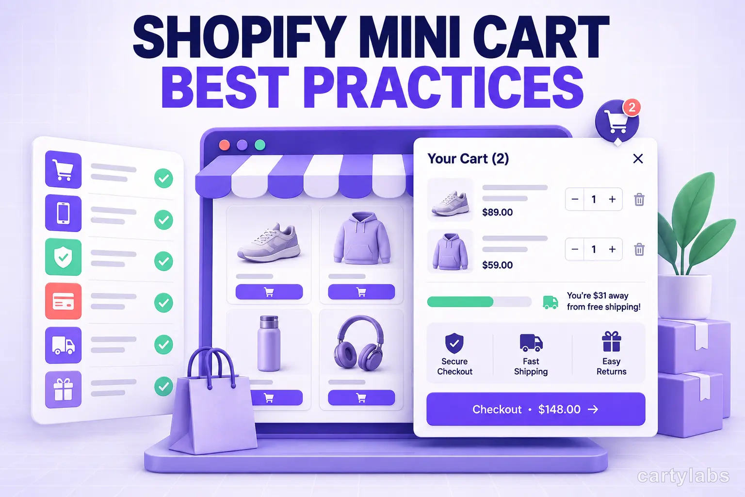
A Shopify mini cart is the small slide-out panel shoppers see when they click the cart icon or add an item. It’s also the single most overlooked surface on most stores. Merchants spend weeks polishing the product page and then ship a default mini cart with broken thumbnails, missing trust copy, and a checkout button that disappears under the iOS keyboard.
This guide is the working checklist we use when auditing Shopify mini carts: 12 patterns that consistently move the needle, with examples and the conversion impact we’ve seen each one produce.
What “mini cart” means on Shopify in 2026
The terms shift around. For clarity:
- Mini cart: a compact slide-out panel summarizing the current cart. Same surface as a cart drawer or side cart, just often smaller or simpler.
- Cart drawer: same thing, usually with more features.
- Slide cart: a feature-loaded mini cart with rewards, upsells, and a sticky cart icon.
In this post, “mini cart” means the slide-out panel, regardless of how feature-rich it is. For the longer history, see our Shopify cart drawer guide.
The 12 best practices, in priority order
These are ordered by conversion impact, biggest first. Most stores can ship the top 6 in a day.
1. Open automatically on add-to-cart
Don’t make shoppers click the cart icon to confirm the item went in. Open the mini cart immediately, with a subtle slide animation (200-250ms). Stores that auto-open see 6-9% higher cart-to-checkout versus stores requiring a manual click.
The exception: if your add-to-cart is a multi-step process (variant picker, gift options, engraving), wait until the final confirm before opening.
2. Pre-render the panel; never lazy-load it
If your mini cart fetches its template after the click, there’s a 200-400ms gap between click and visible drawer. That gap reads as “broken” to shoppers and measurably hurts conversion. Pre-render the empty drawer in the page DOM and just toggle visibility.
3. Show a thumbnail per line item
Text-only line items feel cheap and increase removal rate. A 64x64px thumbnail per item is the minimum. Stores that add thumbnails to a previously text-only mini cart see removal rate drop 18-25%.
4. Make the checkout button at least 48px tall on mobile
Apple’s HIG minimum is 44px. We recommend 48 because thumb error margins on phone cases are real. The button should also be full-width, high-contrast, and use action verbs (“Checkout securely,” not “Continue”).
5. Sticky checkout button on mobile
When the cart has 3+ items, the checkout button scrolls off-screen on mobile. Pin it to the bottom of the drawer with a fixed footer. This single change typically lifts mobile cart-to-checkout 4-7%.
6. Add a free-gift progress bar
“$12 to free shipping” is the highest-ROI line of copy in your mini cart. Stacked tiers (free shipping → free gift → percentage off) work even better when your AOV supports it. Median AOV lift across our merchants: 8-14% from a single threshold, 15-22% from stacked tiers.
7. Show 2-4 AI cross-sells
Not 6, not 12. Beyond 4, shoppers stop scanning. The recommendations should be tuned to what’s in the cart, not just generic “best sellers.” Per-store ML models outperform global “frequently bought together” data by roughly 2x in our tests.
8. Surface auto-applied discounts as line items
When a discount applies automatically, shoppers want to see it land rather than have it disappear into a subtotal calculation. List it as its own line (“Spring promo: -$8.00”) above the subtotal. This builds trust and reduces “where did my discount go?” support tickets.
9. Trust microcopy under the checkout button
A single line, three trust signals: “Secure checkout · Free returns · Ships in 2 days.” This costs nothing and recovers shoppers who hesitate at the last step. Don’t overdo it; one line, not a paragraph.
10. Express checkout buttons above the main CTA
Shop Pay, Apple Pay, Google Pay buttons render above the main checkout button. For mobile shoppers with one-tap payment set up, this collapses checkout to a single tap. Express checkout users convert 2-3x better than standard checkout users.
11. Quantity stepper, not a dropdown
A +/- stepper is faster than a select dropdown and feels native on mobile. Use a 1-99 range; reject 0 and prompt for explicit removal instead, otherwise shoppers accidentally empty their cart.
12. Promo code field collapsed by default
A visible promo field signals “you should look for a code elsewhere” and sends shoppers to Honey or RetailMeNot, where 60% don’t return. Collapse it behind a “Have a code?” link. If you have an active campaign, auto-apply the code instead of asking shoppers to enter it.
Layout: top-to-bottom order that works
The vertical order of elements inside the mini cart matters more than most stores realize. From top to bottom:
- Cart count + close button
- Free-gift progress bar
- Line items
- Cross-sell carousel (3-4 items)
- Promo code link (collapsed)
- Subtotal + estimated shipping
- Express checkout buttons
- Main checkout button
- Trust microcopy
The progress bar belongs at the top because it answers “should I add more?” before shoppers see their subtotal. Cross-sells go below line items, not above, because shoppers want to confirm what’s in their cart before considering additions.
Mobile-specific rules
70% of Shopify traffic is mobile, and most mini carts are designed desktop-first. A few mobile-only rules:
- Slide in full-width. Don’t try to keep the underlying page visible. The screen is too small.
- Add swipe-to-close from the right edge. iOS shoppers expect this; not having it feels broken.
- Test keyboard avoidance. When the promo code field gets focus, iOS Safari raises the keyboard and often hides the checkout button. Make sure the drawer scrolls correctly with
padding-bottomset toenv(keyboard-inset-height). - Avoid hover states. Style for tap, not hover. Hover-only affordances (like a remove button that appears on item hover) don’t work on mobile.
For the broader mobile playbook, see our mobile conversion optimization guide.
Copy that actually works inside the mini cart
Mini cart copy is mostly microcopy, but the words matter. A few patterns that consistently outperform defaults:
| Element | Default copy | Better copy | Why |
|---|---|---|---|
| Empty state | ”Your cart is empty" | "Your cart is empty. Browse bestsellers.” | Gives a next action |
| Checkout button | ”Checkout" | "Secure checkout” | Adds trust signal in CTA |
| Free shipping bar | ”Free shipping at $50" | "$12 to free shipping” | Shows progress, not threshold |
| Add-on prompt | ”Frequently bought together" | "Customers also added” | More social proof, less algorithmic |
| Remove confirmation | ”Remove?” | (no confirmation, just remove with undo toast) | Confirmations cost more than accidental removes |
Small wording shifts typically move conversion 1-3% individually. They stack.
Three real examples worth studying
Without naming names, here are three mini cart patterns we’ve seen work particularly well in 2026:
Beauty brand, $80 AOV. Mini cart leads with a stacked rewards bar (free shipping at $50, free sample at $80, free gift at $120). Cross-sells are limited to 3 items, all complementary categories (cleanser → moisturizer, etc.). AOV lifted 19% in the first 30 days after launch.
Supplements brand, $60 AOV. Mini cart shows a subscription toggle on each line item (one-time vs. subscribe and save 15%). Conversion to subscribe sits at 22% of cart additions, dramatically improving LTV.
Apparel brand, $110 AOV. Mini cart includes a “Complete the look” cross-sell that shows 2 items based on the most recently added product’s category. AOV lift of 14%, items per cart up from 1.6 to 2.0.
Common mistakes to avoid
The patterns we see go wrong most often:
- Two checkout buttons that disagree. If the drawer says “Checkout” and the cart page button says “Place order,” shoppers get confused. Use one verb everywhere.
- Showing line items without prices. Shoppers want a per-item price next to the quantity, not just a subtotal at the bottom.
- Cross-sells that include items already in the cart. Filter the cross-sell list against the current cart contents on the client side.
- Free-shipping bars that don’t update on quantity change. If the shopper increases quantity, the progress bar must recompute live.
- Drawer width too narrow on desktop. Less than 380px makes line items cramp. 400-480px is the sweet spot.
How to ship these in a week
If you’re starting from a default Shopify mini cart, the realistic order is:
- Day 1: pre-render, auto-open, sticky mobile checkout button, 48px CTA height
- Day 2: thumbnails, qty stepper, trust microcopy
- Day 3-4: free-gift progress bar with a single threshold
- Day 5-6: AI cross-sells (3 items max)
- Day 7: copy polish, A/B test setup
Stores using an all-in-one slide cart app skip steps 3-5 because those features ship pre-built. Custom theme work realistically takes 1-2 weeks for the same scope.
A short summary
A Shopify mini cart isn’t a small thing. It’s the panel where shoppers commit, hesitate, or bounce, and small UX choices stack into measurable AOV and conversion lifts. The 12 patterns above are the ones we’ve seen move the numbers most reliably across stores doing $10k-500k/month.
Pre-render the drawer, add thumbnails, ship a stacked rewards bar, keep cross-sells to 3-4, and pin the checkout button on mobile. That’s 80% of the wins, available to most stores in a week.
Want to see what a fully tuned mini cart looks like on your store? Install Cartylabs free on Shopify, or book a 15-minute demo and we’ll audit your current mini cart on the call.
Next steps
Related Shopify resources
Practical tools and product pages related to this guide.
Keep reading
All articles →
Slide Cart vs Cart Drawer vs Cart Page: Which Converts Best?
Slide cart vs cart drawer vs cart page: a data-backed breakdown of which Shopify cart UX converts best, when each one wins, and how to pick for your store.
15 Shopify Cart Drawer Examples That Increase AOV
15 real Shopify cart drawers, graded on free-shipping bars, upsells, bundles, rewards, and mobile UX — with the exact tactic to copy from each.
Cart Page vs Cart Drawer on Shopify: Which Converts Better?
Cart drawer or cart page on Shopify? A data-backed decision guide covering mobile, upsells, speed, and the store types where a cart page still wins.
 Install Cart — Free