Shopify Mobile Conversion Optimization: 14 Fixes That Work
Mobile is 70% of Shopify traffic but converts at half the rate of desktop. 14 mobile CRO fixes, from sticky carts to touch targets, that work.
In this article
- 01 1. Add a sticky add-to-cart bar#
- 02 2. Replace the cart page with a slide-out drawer#
- 03 3. Make every touch target at least 48px tall#
- 04 4. Use one-thumb navigation#
- 05 5. Reduce form fields at every step#
- 06 6. Enable Shop Pay#
- 07 7. Compress and lazy-load product images#
- 08 8. Avoid carousels above the fold#
- 09 9. Use sticky variant pickers#
- 10 10. Compress your third-party script load#
- 11 11. Use the right keyboard for each field#
- 12 12. Minimize forced interruptions#
- 13 13. Show free-shipping thresholds in mobile-friendly copy#
- 14 14. Test mobile checkout monthly#
- 15 How to measure mobile conversion lift#
- 16 Common mobile CRO mistakes#
- 17 A 30-day mobile CRO plan#
- 18 A short summary#
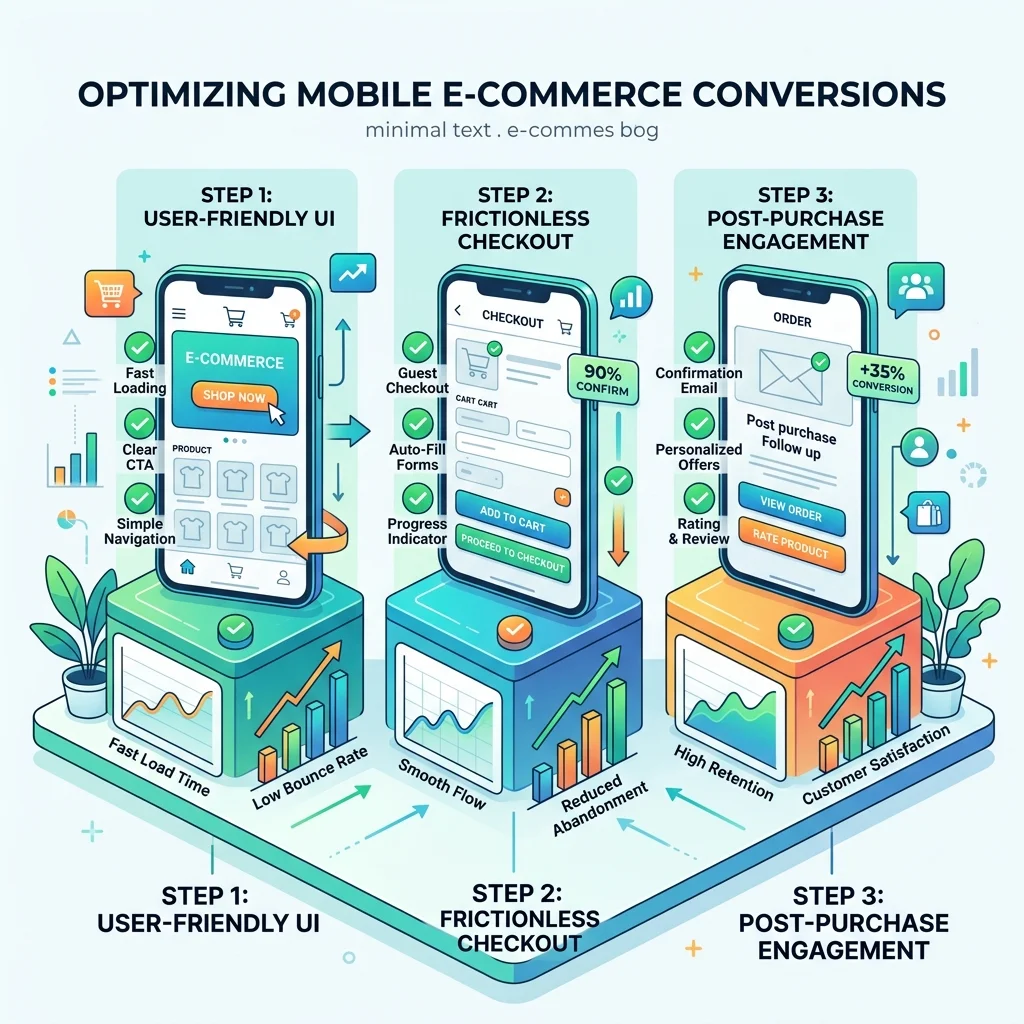
The average Shopify store gets ~70% of its traffic from mobile devices but only ~40% of its revenue. The gap is mobile conversion rate, typically 1.5-2.5% on mobile versus 3.5-5% on desktop.
Some of that gap is inherent to mobile (slower networks, smaller screens, distracted shoppers). Most of it is fixable. Below are 14 Shopify mobile CRO fixes that consistently move conversion, ranked roughly by impact.
1. Add a sticky add-to-cart bar
The single highest-impact mobile change. A persistent buy button at the bottom of product pages keeps the CTA in thumb-reach as shoppers scroll. Expect 3-7% mobile conversion lift on its own. (Full guide: the sticky add-to-cart bar.)
2. Replace the cart page with a slide-out drawer
The default /cart URL forces shoppers to navigate away from the product, then back. A slide-out drawer keeps browse context intact and lifts mobile cart-to-checkout 5-12%.
3. Make every touch target at least 48px tall
Apple’s Human Interface Guidelines minimum is 44px. Stick to 48 to give thumbs error margin. Shopify themes routinely ship 36-40px buttons that test fine on a desktop but miss on mobile.
4. Use one-thumb navigation
Important controls (cart icon, menu, search) belong in the bottom 60% of the screen on mobile. The top corners are out of reach for one-handed use.
5. Reduce form fields at every step
Every field is friction. On mobile, that friction compounds:
- Don’t ask for both first/last name in separate fields. Use “Full name.”
- Skip “Confirm email.”
- Skip “Phone number” unless you absolutely need it.
- Use Shopify’s accelerated checkout (Shop Pay, Apple Pay, Google Pay) to skip address entry entirely.
For impulse-purchase categories, also consider Quick Buy / fast checkout buttons that skip the cart entirely.
6. Enable Shop Pay
Shop Pay’s one-tap checkout converts 1.7x better than guest checkout, per Shopify’s own data. It should be enabled and prominently displayed in your buy box.
7. Compress and lazy-load product images
Mobile networks aren’t always fast. A 2MB hero image is the difference between a sub-2-second LCP and a 5-second one that drives shoppers away. Use Shopify’s built-in image transformations and add loading="lazy" below the fold.
8. Avoid carousels above the fold
Carousels test poorly on mobile: shoppers don’t see slides past the first, and the rotation distracts from the buy decision. Use a single hero image instead.
9. Use sticky variant pickers
For products with size or color variants, the variant picker should stay visible as shoppers scroll. Otherwise they have to scroll back to change selection, and many won’t bother.
10. Compress your third-party script load
Apps that inject blocking JavaScript on every page can add 1-3 seconds to mobile load time. Audit your Online Store → Themes → Edit code → theme.liquid for third-party scripts, and use Shopify App Embeds (which load asynchronously) wherever possible.
Cartylabs, by design, loads asynchronously via App Embed and is performance-budgeted to add under 50ms to mobile page load.
11. Use the right keyboard for each field
type="email" triggers an email keyboard. type="tel" triggers a number pad. inputmode="decimal" for prices. Each shaves 1-2 seconds off form completion.
12. Minimize forced interruptions
Modals, full-screen popups, age gates, and email capture overlays kill mobile conversion harder than desktop. If you must use them:
- Trigger on exit-intent or scroll depth, not page load
- Make the close button big and obvious
- Remember the dismissal and don’t show it again the same session
13. Show free-shipping thresholds in mobile-friendly copy
“$12 to free shipping” reads better than a 4-segment progress visualization on a 375px screen. Keep the copy short and the bar slim.
14. Test mobile checkout monthly
Open your store on a real phone (not Chrome DevTools mobile emulator) and complete a real checkout once a month. Things break: apps update, themes drift, payment gateways add new flows. The five minutes you spend catching it beats waiting for a customer to email about a broken checkout.
How to measure mobile conversion lift
The right comparison: mobile conversion rate week-over-week, not lifetime. Mobile traffic mix shifts seasonally and by traffic source, so YoY comparisons can be misleading.
Track:
| Metric | Desktop benchmark | Mobile benchmark |
|---|---|---|
| Conversion rate | 3.5-5% | 1.5-2.5% (target: close the gap) |
| Cart-to-checkout | 55-70% | 40-55% |
| Checkout completion | 70-85% | 55-70% |
| Add-to-cart rate | 8-12% | 5-9% |
If your mobile conversion is below 1.5%, work the list above in order. The first three fixes (sticky bar, drawer, touch targets) move the needle most.
Common mobile CRO mistakes
Designing on a 27” monitor and never testing mobile. Most mobile UX issues are obvious within 30 seconds of using the store on an actual phone.
Assuming mobile shoppers behave like desktop shoppers. They don’t. Mobile sessions are shorter, more interrupted, and more impulse-driven. Optimize for the mobile-specific patterns: sticky buy buttons, accelerated checkout, fewer steps.
Burying the price. On mobile, the price is one of the few things shoppers can see at a glance. Make it big. Show it twice if needed (above and below the buy button).
Letting the keyboard cover the submit button. Test every form on iOS Safari and Android Chrome. The keyboard often hides primary CTAs.
Hiding important reviews behind tabs. Mobile shoppers don’t tap tabs they don’t have to. Show the first 2-3 reviews inline.
A 30-day mobile CRO plan
Week 1: Sticky add-to-cart bar. Slide-out cart drawer. Audit touch targets.
Week 2: Enable Shop Pay. Compress hero images. Lazy-load below the fold.
Week 3: Audit third-party scripts. Remove blocking JS. Run PageSpeed Insights mobile.
Week 4: Reduce form fields at checkout. Test mobile checkout end-to-end on a real device. Set up weekly mobile conversion reporting.
A typical Shopify store running this list closes 30-50% of the desktop/mobile conversion gap inside a quarter.
A short summary
Mobile conversion is the biggest revenue lever most Shopify stores are leaving on the table. The fixes are small, well-known, and mostly take an afternoon, but they have to be shipped together to compound.
Want a cart that’s mobile-optimized out of the box? Install Cartylabs free on Shopify. Sticky bars, drawer, and accelerated checkout are all included, with a 14-day free trial.
Learn more: Shopify cart drawer app, Shopify sticky cart
Keep reading
All articles →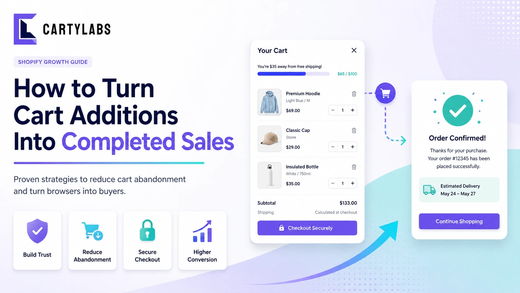
How to Turn Cart Additions Into Completed Sales on Shopify
Convert more Shopify cart additions into completed sales with proven tactics for reducing cart-to-checkout drop-off, optimizing the cart drawer, and timing reassurance messaging.
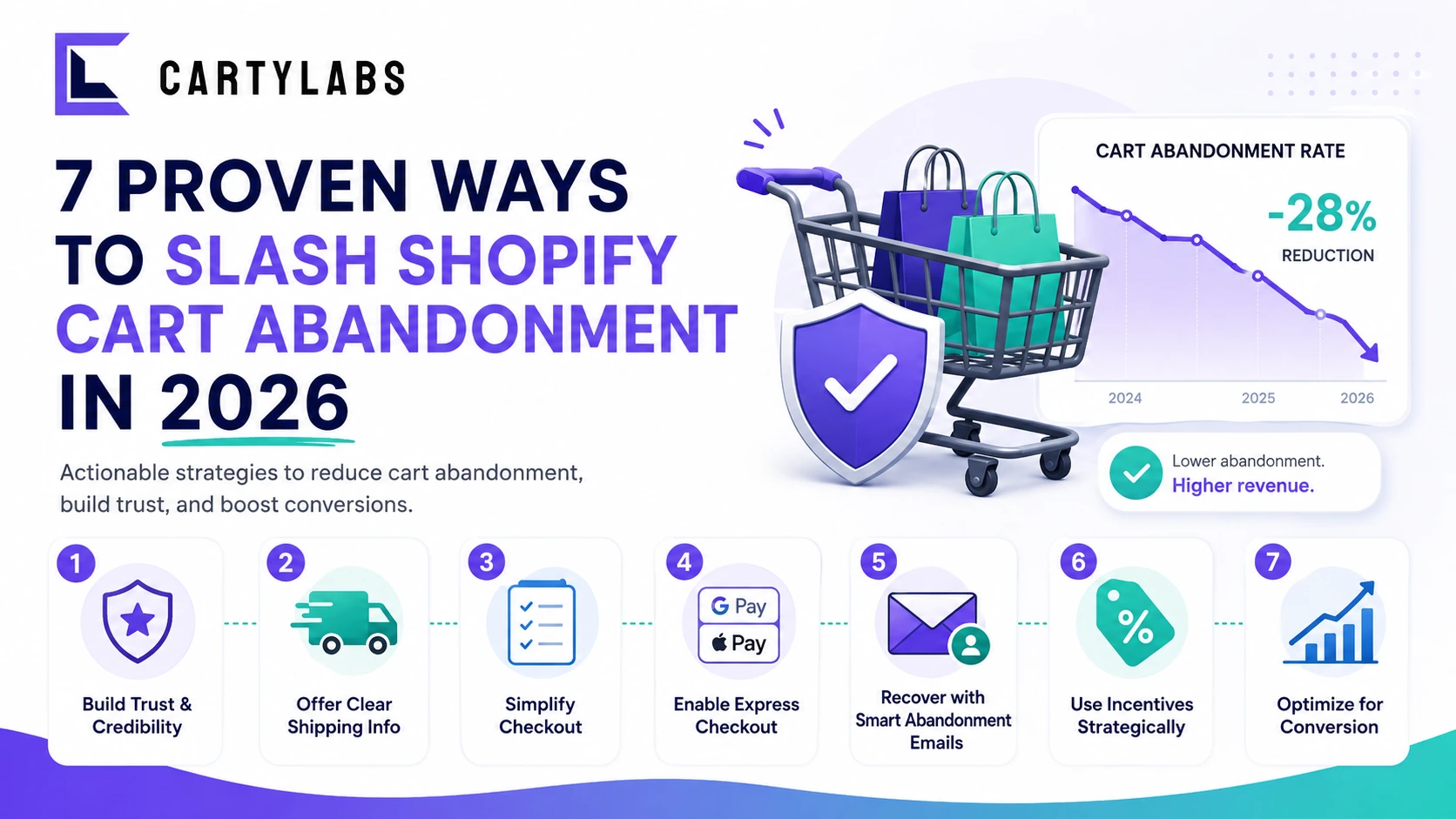
7 Proven Ways to Slash Shopify Cart Abandonment in 2026
Cut Shopify cart abandonment fast with seven field-tested tactics covering shipping transparency, express checkout, exit recovery, trust signals, and post-purchase win-back.

The Shopify CRO Checklist: 80 Fixes That Actually Move Conversion in 2026
A no-fluff conversion rate optimization checklist for Shopify. Homepage, PDP, cart, checkout, and post-purchase. 80 high-impact fixes ordered by leverage, with the diagnostic question for each.
 Install Free Checkout App