
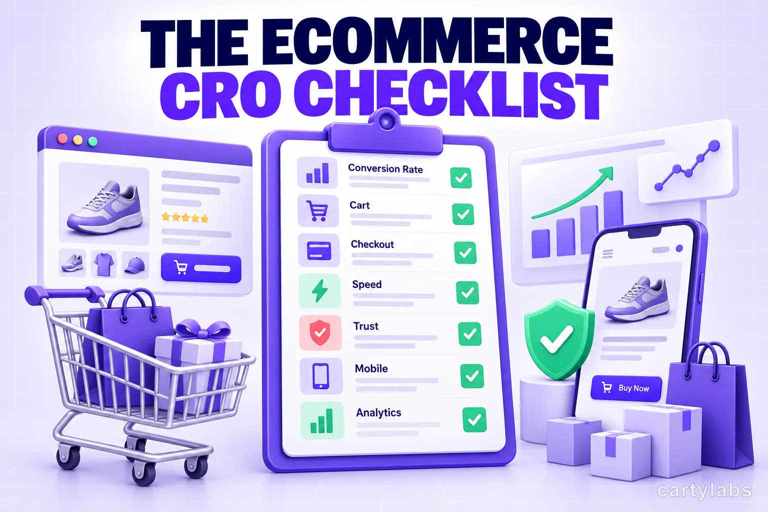
The Ecommerce CRO Checklist: 60 Checks From Instrumentation to Post-Purchase
A platform-neutral conversion rate optimization checklist for ecommerce. Instrumentation, prioritization, test design, and 40 page-level checks across landing, product, cart, checkout, and post-purchase.
In this article
- 01 1. Instrumentation — before you change anything (8 checks)#
- 02 2. Prioritization — picking the right thing (6 checks)#
- 03 3. Test design — believing the result (6 checks)#
- 04 4. Landing and category pages (7 checks)#
- 05 5. Product pages (9 checks)#
- 06 6. Cart (7 checks)#
- 07 7. Checkout (9 checks)#
- 08 8. Mobile and speed (5 checks)#
- 09 9. Post-purchase and retention (3 checks)#
- 10 How to actually work through this#
Most CRO checklists are a list of tactics. Tactics are the easy part. What separates stores that compound conversion gains from stores that run twelve tests and end the year flat is the boring scaffolding around the tactics: whether you can measure a change, whether you picked the right change, and whether you ran it long enough to believe the result.
So this checklist starts with the scaffolding. Sections 1-3 are the program. Sections 4-9 are the page-level work.
It’s deliberately platform-neutral — the principles hold on Shopify, WooCommerce, BigCommerce, or custom. If you’re on Shopify and want the platform-specific version with app-level implementation detail, use the Shopify CRO checklist instead; it covers the same ground with Shopify’s surfaces named directly.
1. Instrumentation — before you change anything (8 checks)
You cannot optimize what you cannot measure, and most stores discover their analytics were wrong after running a quarter of tests.
- Ecommerce tracking fires on every step. View item, add to cart, begin checkout, add shipping info, add payment info, purchase. Missing steps mean you can’t locate the leak.
- Purchase events deduplicate. Refreshing the thank-you page must not create a second purchase event. Check by refreshing a test order and watching the count.
- Analytics revenue reconciles with your backend. Pull last month from both. If they disagree by more than ~5%, fix that before anything else — every test result you read is built on this number.
- Cross-domain and payment-gateway returns preserve the session. If shoppers bounce to a hosted payment page and back, verify the session survives. Broken here, all your revenue attributes to “direct” and every channel test is garbage.
- Bot and internal traffic are filtered. Your own team, your dev environment, and known crawlers excluded.
- A funnel report exists that you actually look at. Sessions → product view → add to cart → checkout start → purchase, with a drop-off rate at each step.
- Segment the funnel by device. Mobile and desktop behave differently enough that a blended number hides most problems.
- Session recordings and heatmaps on the top 5 pages. Quantitative data tells you where people leave. Qualitative tells you why.
2. Prioritization — picking the right thing (6 checks)
- Rank by leak size, not by opinion. The step with the biggest absolute drop-off gets worked first. A 2% lift on checkout beats a 40% lift on a page 300 people see.
- Estimate the ceiling before building. If the page gets 400 sessions a month, no test on it will ever reach significance. Fix it with judgment and move on.
- Score effort honestly. A ranked list weighted by impact-over-effort keeps you from spending six weeks on a redesign while a broken shipping-cost display leaks daily.
- Check the obvious breakage first. Before any test: does the site work on the three most common devices in your analytics, in the two most common browsers? Bugs masquerade as conversion problems constantly.
- Read your support tickets and reviews. The recurring question in your inbox is a conversion problem with a queue attached.
- Keep a decision log. What you tested, what you predicted, what happened. Without it you will re-run the same test in eighteen months.
3. Test design — believing the result (6 checks)
- Fix the sample size before you start. Decide the minimum detectable effect and required sample up front. Peeking at a running test and stopping when it looks good is how stores accumulate imaginary wins.
- Run full weeks. Weekday and weekend buyers differ. A test stopped on a Thursday is measuring the day, not the change.
- Run at least two business cycles. One week is almost never enough, regardless of what the significance number says.
- Test one meaningful change at a time. Bundled changes tell you something moved but not what — and you’ll keep the losing half.
- Measure revenue per visitor, not conversion rate alone. A change that lifts conversion while dropping AOV can be a net loss. This catches more bad “wins” than any other single check.
- Accept flat results as results. Most tests don’t win. A program where everything wins is a program with broken measurement.
4. Landing and category pages (7 checks)
- The page answers “am I in the right place?” within one screen. What you sell, who it’s for, why here.
- Above-the-fold content doesn’t wait on a carousel. Rotating heroes bury everything after slide one.
- Category pages show price, primary image, and a rating on every card. Shoppers filter on these before they click anything.
- Filters match how customers think, not how your database is structured. Size, price, colour, use case — not internal taxonomy.
- Sort defaults to something commercially sensible. Best-selling or featured. Never “newest” unless newness is the proposition.
- Out-of-stock items are demoted or hidden, never mixed in at full prominence.
- Site search returns results for misspellings, synonyms, and plural forms. Search users convert at multiples of browse users; a zero-results page is a lost order. Test your ten most-searched terms by hand.
5. Product pages (9 checks)
- Price, availability, and primary CTA visible without scrolling on mobile.
- Images cover the questions text can’t answer — scale, texture, what’s in the box, worn or in use.
- Shipping cost and delivery estimate appear on the product page, not first at checkout. Unexpected shipping cost is the most-cited abandonment reason in every study that asks.
- Return policy is one tap away and stated in plain language.
- Reviews are on the page, not behind a tab — with the count and average near the title.
- Variant selection can’t produce an invalid state. Selecting a colour must disable sizes that don’t exist in it.
- The description answers objections, not just specifications. Specs say what it is; objection-handling says why it’s right for this buyer.
- Stock and urgency signals are true. Fake scarcity is detectable, and it costs more in trust than it earns in urgency.
- Complementary products are suggested, priced below the anchor item, and limited to two or three. More options at this moment slows the decision. See best Shopify cross-sell apps.
6. Cart (7 checks)
- Adding to cart doesn’t navigate away from browsing. A drawer or slide-out keeps the shopping session alive; a full cart-page redirect ends it.
- The cart shows the delivered total — shipping and tax estimated, not deferred.
- Progress toward free shipping is visible and specific. “$14 away from free shipping” reliably lifts AOV where a generic threshold banner does not.
- Quantity edit and remove work without a page reload.
- Express payment buttons sit at the top of the cart, not below the line items.
- Discount code fields don’t dominate. A prominent empty code box sends shoppers off-site hunting for a coupon, and many don’t come back. Keep it present but understated.
- Cart contents survive a session. Returning shoppers should find their cart intact.
7. Checkout (9 checks)
- Guest checkout is available and offered first. Forced account creation is among the highest-cost friction points in ecommerce.
- Ask for the minimum. Every optional field costs completions. Phone number, company, “how did you hear about us” — cut or make optional.
- Address autocomplete is enabled. It reduces both typing and failed deliveries.
- Validation is inline and specific. “Card number is 16 digits” beats a red box, and beats a full-page error after submit.
- Errors preserve everything already entered. Wiping a filled form on a validation failure ends sessions.
- Payment methods match the market. Wallets where wallets dominate, bank transfer or BNPL where those do. A missing local method is an invisible wall.
- A progress indicator shows where they are in a multi-step checkout — or use one page. Both work; ambiguity doesn’t.
- Trust signals appear at the payment step, where the anxiety actually is. Security badges on the homepage do nothing.
- The checkout works on a slow 3G connection. Test it throttled. Payment steps are the heaviest pages on most stores.
8. Mobile and speed (5 checks)
- Largest Contentful Paint under 2.5s on mobile, measured on real-world field data rather than a lab score.
- No layout shift after load. Content jumping as images and banners arrive causes mis-taps on the buy button.
- Tap targets are large enough and far enough apart. Variant swatches and quantity steppers are the usual offenders.
- Interstitials don’t fire on entry. A popup before the first scroll costs more than the emails it captures.
- Test on a real mid-range Android device. Not a simulator, not the newest iPhone. That’s what most of your traffic is holding.
9. Post-purchase and retention (3 checks)
- The thank-you page does a job — order tracking, account creation with the data already collected, a relevant one-click add-on.
- Transactional emails are on and correct. Order confirmation, shipping notification, delivery. These have the highest open rates you will ever get.
- Abandonment recovery is running with honest attribution. See best Shopify abandoned cart recovery apps — and audit the recovered-revenue number against total store revenue before you trust it.
How to actually work through this
Don’t attempt all sixty. In order:
- Week one: section 1 only. Fix instrumentation. Everything downstream depends on it, and it’s the section stores skip.
- Week two: walk the funnel and find the biggest drop-off. One number, one step.
- Week three onward: work only the section covering that step. Ship the obvious fixes without testing them — nobody needs an A/B test to prove address autocomplete helps. Test only the genuinely uncertain changes.
- Re-measure the funnel monthly. The biggest leak moves once you fix it. Follow it.
The stores that compound gains aren’t running more tests. They’re measuring correctly, fixing the obvious things immediately, and testing only where the answer is genuinely unknown.
If you’re on Shopify, the Shopify CRO checklist covers this same ground with 80 platform-specific fixes and the exact surfaces named.
Related reading: The Shopify CRO checklist, Shopify product page best practices, Shopify checkout UX best practices, Shopify mobile conversion optimization.
Next steps
Related Shopify resources
Practical tools and product pages related to this guide.
Keep reading
All articles →
The Shopify CRO Checklist: 80 Fixes That Actually Move Conversion in 2026
A no-fluff conversion rate optimization checklist for Shopify. Homepage, PDP, cart, checkout, and post-purchase. 80 high-impact fixes ordered by leverage, with the diagnostic question for each.
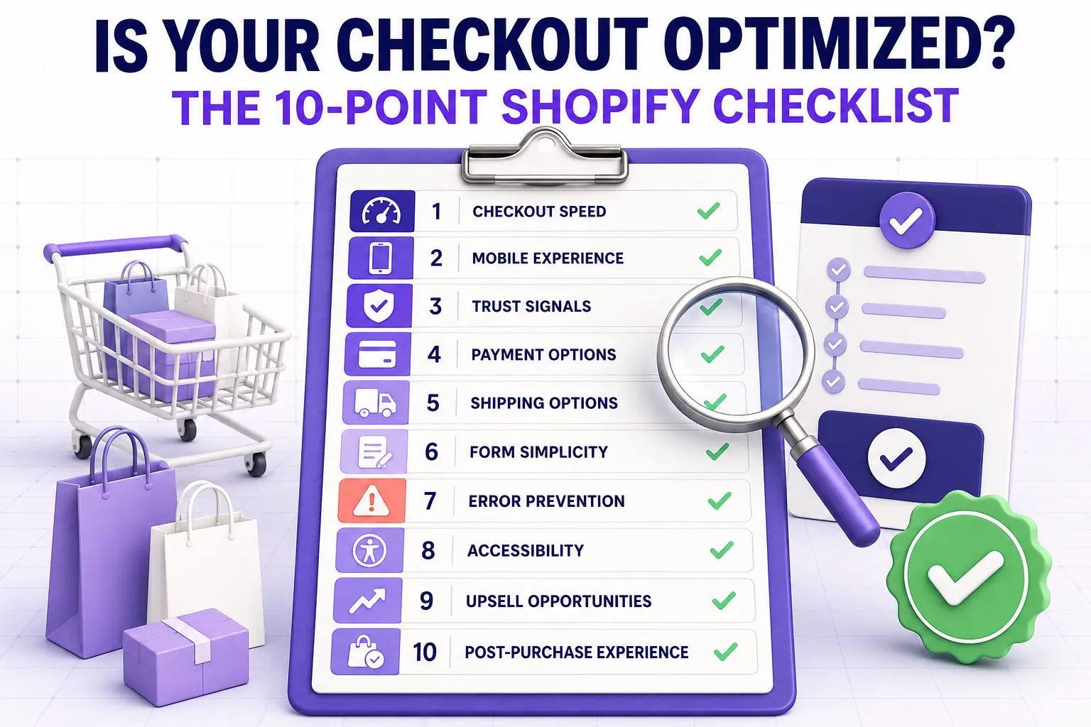
Is Your Shopify Checkout Optimized? A 10-Point Checklist
Audit your Shopify checkout in twenty minutes using this ten-point conversion checklist covering speed, mobile, trust, payment, shipping, and the post-purchase experience that most stores miss.
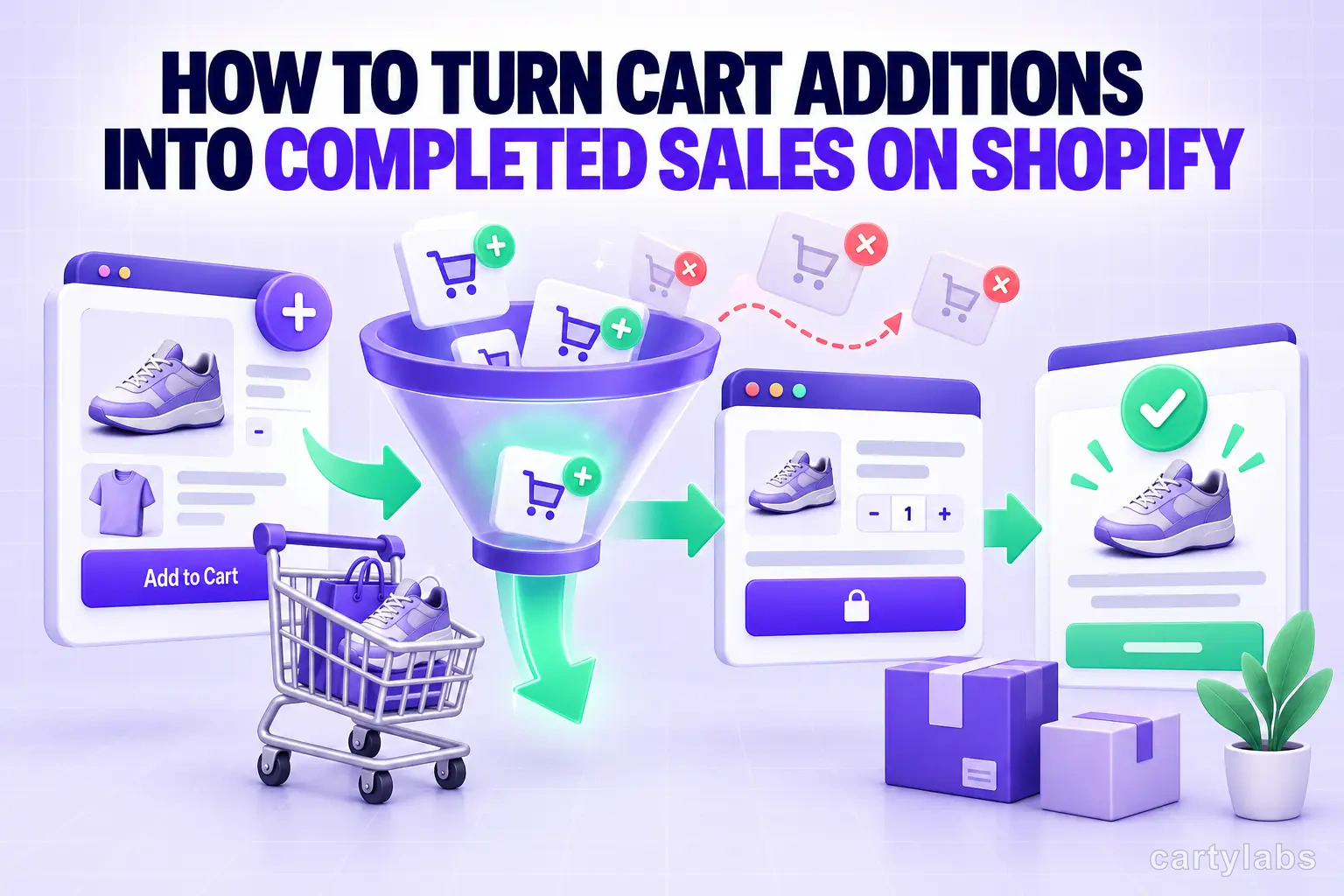
How to Turn Cart Additions Into Completed Sales on Shopify
Convert more Shopify cart additions into completed sales with proven tactics for reducing cart-to-checkout drop-off, optimizing the cart drawer, and timing reassurance messaging.
 Install Cart — Free