Shopify Checkout UX Best Practices: 30 Design Principles for 2026
The complete UX playbook for Shopify checkout. Form design, mobile patterns, error handling, trust, accessibility, and post-purchase. 30 principles backed by checkout research and real Shopify data.
In this article
Most checkout UX advice is either Baymard-Institute-grade research no one has time to read, or generic “reduce friction” platitudes. This post is the middle: 30 specific UX principles for Shopify checkout in 2026, each one a concrete design or copy decision, each backed by what actually moves the needle on Shopify.
For the underlying API model (what you can actually customize), see Checkout Extensibility explained. For the funnel-level diagnostic framework, see the Shopify checkout optimization guide.
The three jobs of checkout UX
Before the principles: checkout UX has three jobs, in order.
- Don’t lose the sale you’ve already earned. The customer already decided to buy. Every UX choice should make completing the purchase easier than abandoning it.
- Build trust at the moment money changes hands. Even returning customers re-evaluate at this step.
- Set up the next purchase. The Thank You page is the highest-attention surface in the entire customer journey. Don’t waste it.
Almost every principle below is in service of one of those three.
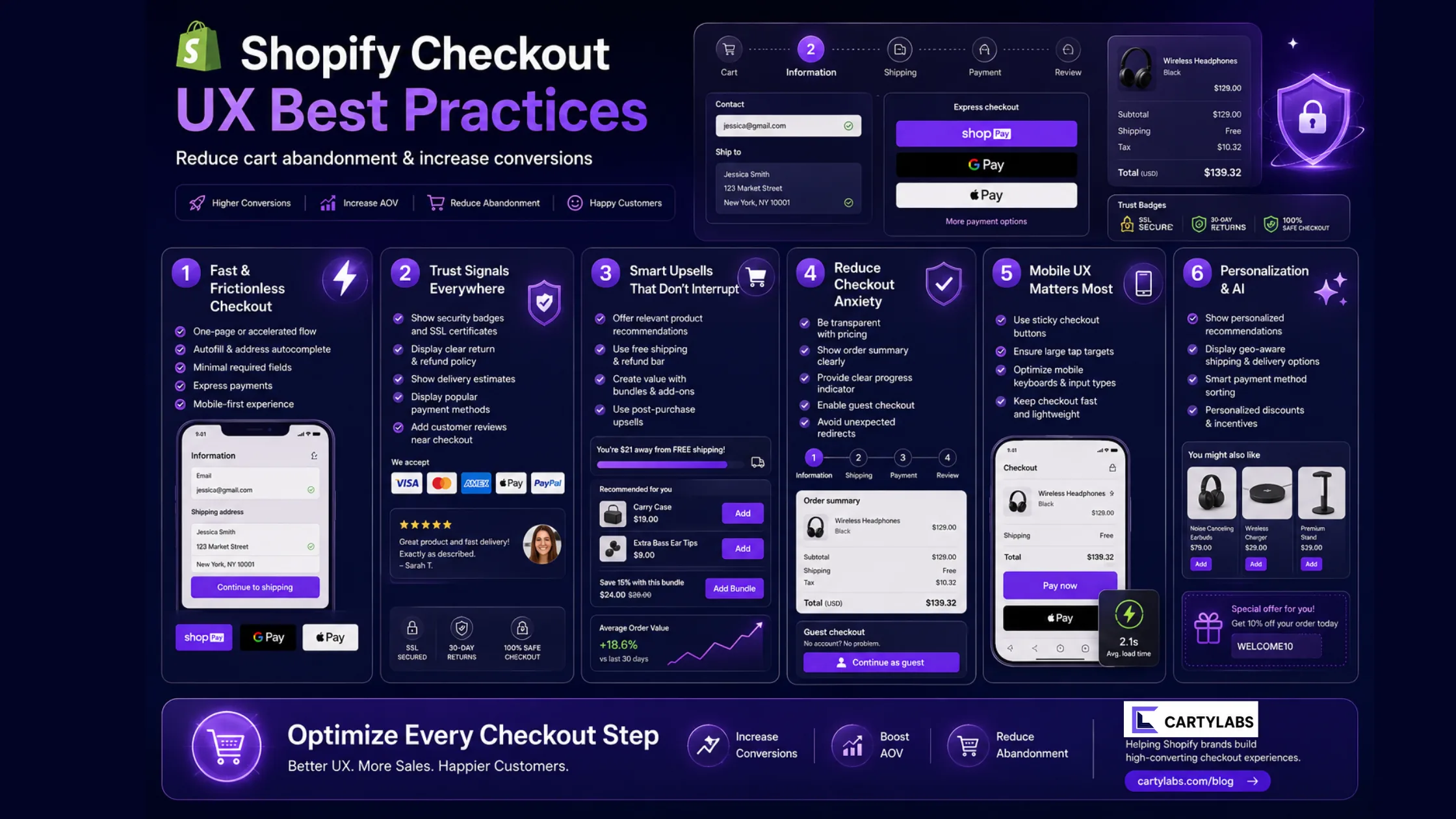
Form design (1–8)
1. One column, top to bottom
Multi-column forms force users to scan in a Z-pattern and inflate completion time. Single column reads top-to-bottom on every device.
2. Field order matches mental model, not database schema
Email, name, address, shipping, payment. Not name, email, phone, address. The order should match how a customer thinks about giving you the information, not how your CRM stores it.
3. Labels above fields, not inside
In-field placeholder labels disappear when the user starts typing and become a UX trap on review. Labels above the field, always visible.
4. Autocomplete attributes on every field
autocomplete="email", autocomplete="given-name", autocomplete="postal-code", and so on. Without these, mobile autofill breaks. Shopify’s native checkout handles this. Verify any custom field you add does too.
5. Inline validation, not on submit
Validate the email field on blur. Validate the ZIP on blur. Surface errors next to the field, in the exact moment the user can fix them. Submit-time validation forces re-scanning a form they thought they’d finished.
6. Error messages name the problem and the fix
“Invalid input” is useless. “ZIP code must be 5 digits; looks like one is missing” is what you want.
7. Optional fields explicitly marked, not required ones
Most fields will be required, so marking required fields with asterisks adds visual noise. Mark the optional ones as “(optional)” instead.
8. Don’t ask twice
Don’t confirm-email. Don’t confirm-password at checkout (that’s a Klaviyo-flow problem, not a checkout problem). Don’t re-ask the address. Every duplicate field is a friction point with no upside.
Mobile patterns (9–14)
9. Mobile-first means mobile-real
Most Shopify traffic is mobile in 2026. Design checkout for the iPhone Safari viewport first. Test on a real device, not Chrome DevTools.
10. Sticky order summary, collapsed by default on mobile
The order summary should be at the top of mobile checkout, collapsed to a 1-line “Show order summary ▼ $XX.XX” with a tap-to-expand. Always-visible eats vertical space. Hidden creates uncertainty. Collapsed wins.
11. Express checkout buttons before the form
Shop Pay, Apple Pay, and Google Pay above the email field on mobile. The single highest-leverage mobile checkout move on Shopify. See more details in Shop Pay one-tap patterns.
12. Numeric keyboards for numeric fields
inputmode="numeric" on ZIP, phone, and card number. Shopify defaults this on the native fields. Check any custom fields you add.
13. Tap targets at 44×44pt minimum
Apple HIG and Material both. Smaller targets fail thumb-reach tests. Buttons, checkboxes, radio options. All 44pt.
14. Bottom-sticky primary action
The “Continue to shipping” or “Pay now” button should stick to the bottom of the mobile viewport. Floating CTAs above the keyboard, not below it.
Trust and legitimacy (15–20)
15. Brand the checkout
Custom fonts and colors via the Branding API are not cosmetic. They signal you’re a real brand, not a drop-ship aggregator. Unbranded Shopify checkout actively suppresses conversion on premium products.
16. Trust badges inline, not banner-style
Small payment-logo and secure-checkout icons inline with the form. Banner-style “100% SAFE CHECKOUT” graphics read as desperate.
17. Specific shipping and returns copy
“Free shipping on orders over $X, free returns within 30 days, no questions asked.” Concrete and quantified. Vague (“easy returns”) signals less than specific.
18. Real testimonial on the right rail (desktop)
One testimonial with a real name, photo, and 5-star rating. Rotate by cart contents. Counter-signal: stock-photo testimonials read as fake and reduce trust.
19. Real-time social proof, used sparingly
“5 people are viewing this right now” works on PDPs. On checkout, it can read as desperate. Use only if you have a verifiable, real-time signal. Never fake counters.
20. Order summary always shows what’s in the order
Line items with thumbnails, quantities, and per-line prices visible (collapsed default on mobile, expanded on desktop). Hidden cart contents at checkout consistently underperforms.
Reducing decision friction (21–25)
21. Sensible defaults
Default shipping option: cheapest. Default payment: Shop Pay if signed in. Default country: geo-IP’d. Defaults should match what 80% of users would pick.
22. Don’t make customers pick what doesn’t need picking
If there’s only one shipping option, don’t show it as a radio button. If there’s only one payment method available to this customer, expand it. Choices that aren’t real choices are friction.
23. Frame discounts as savings, not just discounts
“Save $12” reads stronger than ”−$12” or “12% off” alone. The strongest is: “You’re saving $12. Code applied automatically.”
24. Show running totals, not just final total
Subtotal, shipping, tax, discount, total. Line by line. Surprise totals at the bottom are the #1 cited reason for abandonment in Baymard’s checkout research.
25. Estimated delivery date, not “Standard shipping”
“Order today for delivery May 22–24” is concrete. “Standard shipping” requires the customer to do mental math.
Accessibility (26–28)
26. Visible focus states on every interactive element
Default Shopify focus rings are fine. Don’t suppress them with CSS. Removing focus rings is a WCAG violation and breaks keyboard users.
27. Sufficient color contrast on form fields, errors, and links
4.5:1 minimum on text. Light-gray placeholder text and pale-pink error text are common Shopify branding mistakes.
28. Screen-reader-friendly error messaging
Errors should be announced via aria-live="polite". Inline errors that only render visually break for assistive tech users.
Post-purchase UX (29–30)
29. The Thank You page is the highest-attention surface in the funnel
Don’t waste it on a generic “Thanks for your order!” Use it for: post-purchase upsell, account creation prompt, referral CTA, onboarding video for the product, or a survey. Choose one primary CTA.
30. Account creation post-purchase, not pre
“Save your order, set a password” on the Thank You page converts 3–5× higher than forced account creation before checkout. The single biggest signup-rate move available on Shopify.
How to operationalize
Five-step audit using this list:
- Open a private window, simulate a real purchase on your store on mobile.
- Screenshot every screen.
- For each principle above, score: ✅ in place, ⚠️ partial, ❌ missing.
- List the ❌s and the ⚠️s.
- Rank by impact (mobile patterns, trust, and post-purchase tend to move the needle hardest).
If you want a complete pattern library to pull individual checkout moves from, see 100 Shopify checkout examples. For the broader CRO checklist that includes everything before checkout (homepage, PDP, cart), see the Shopify CRO checklist.
Cartylabs ships principles 9–14 and 19–25 (the cart and pre-checkout patterns) as defaults: branded, mobile-first, and trust-signal-correct out of the box.
Keep reading
All articles →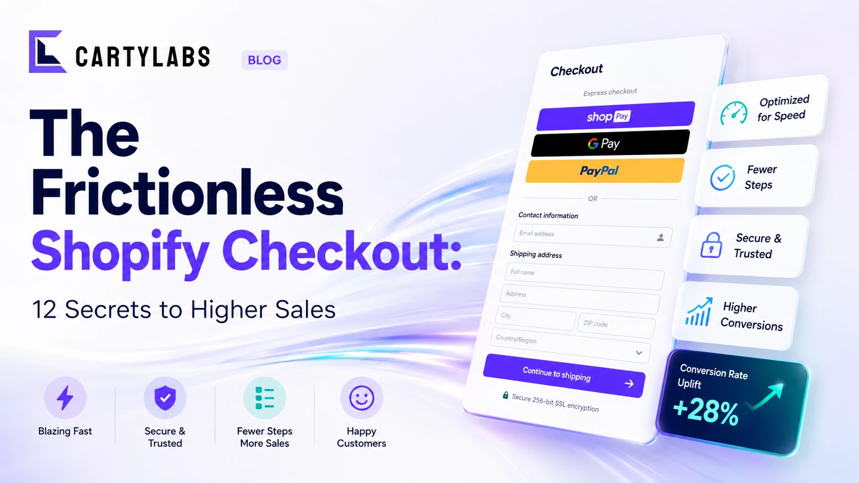
The Frictionless Shopify Checkout: 12 Secrets to Higher Sales
Build a frictionless Shopify checkout with twelve advanced tactics across form design, payment surfacing, dynamic shipping, and intelligent default selection that quietly compound conversion.
How to Integrate Loyalty Rewards Directly Into Shopify Checkout
Surface Shopify loyalty rewards inside checkout with UI extensions, points balance widgets, and redemption flows that lift returning-buyer conversion four to nine percent on stores with mature programs.
In-Checkout Upsells: How to Boost Shopify Order Value in 2026
Add in-checkout upsells on Shopify that lift AOV without dragging conversion. Offer construction, placement, targeting, and the apps that ship the highest-converting in-checkout modules in 2026.
 Install Cart — Free