
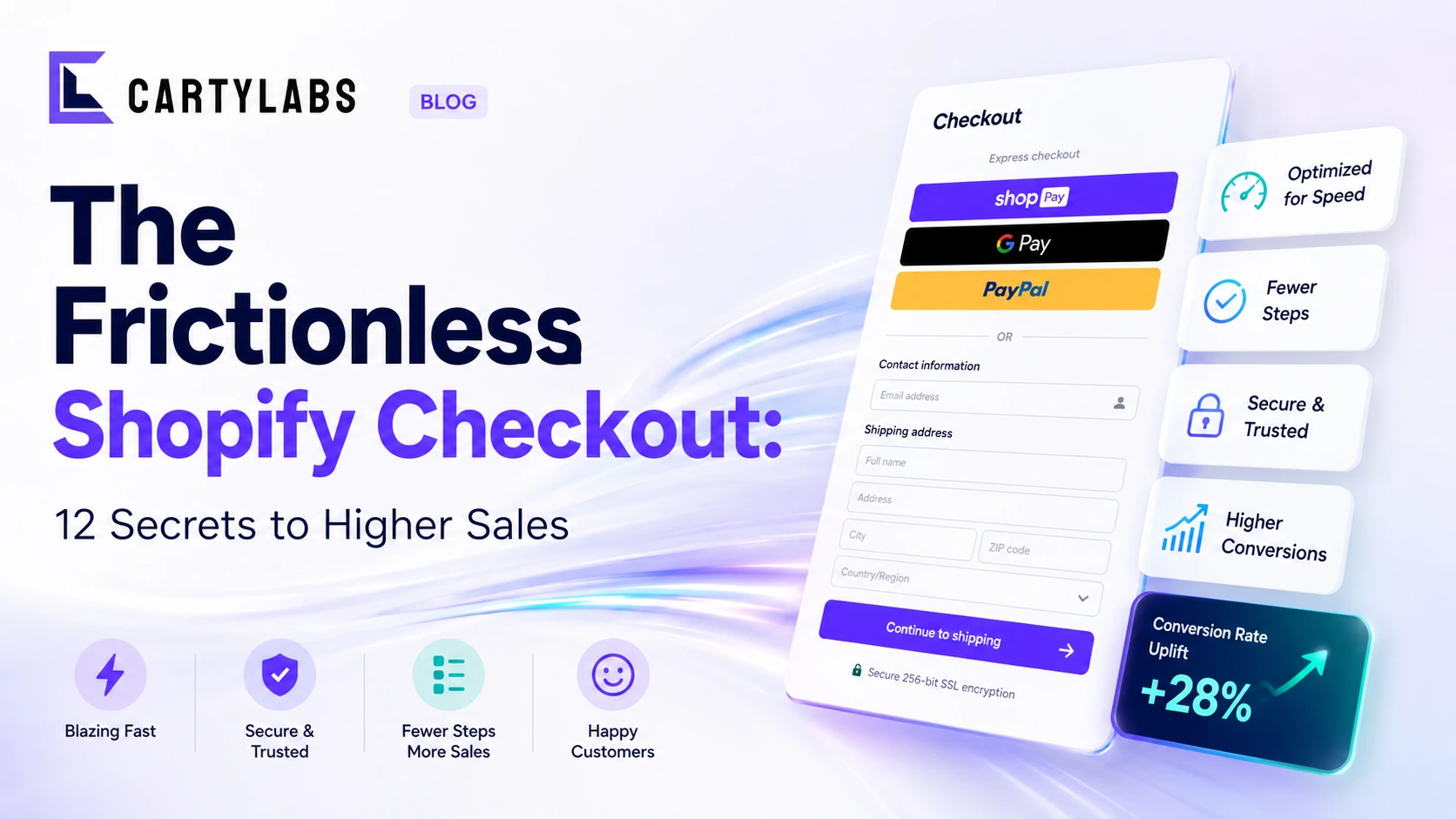
The Frictionless Shopify Checkout: 12 Secrets to Higher Sales
Build a frictionless Shopify checkout with twelve advanced tactics across form design, payment surfacing, dynamic shipping, and intelligent default selection that quietly compound conversion.
In this article
- 01 1. Default to the customer’s likely country and currency#
- 02 2. Pre-fill everything you legally can#
- 03 3. Use one column, full width, with generous vertical spacing#
- 04 4. Show estimated delivery dates, not shipping speed names#
- 05 5. Apply the discount automatically when possible#
- 06 6. Use inline validation that helps, not scolds#
- 07 7. Localize trust elements, not just text#
- 08 8. Remove every field you do not legally need#
- 09 9. Stickify the primary CTA on mobile#
- 10 10. Default shipping to the cheapest acceptable option#
- 11 11. Show the running total, line by line#
- 12 12. Treat the Thank You page as part of the checkout#
- 13 Putting it together#
A frictionless Shopify checkout is not a single redesign. It is twelve small wins compounded into one fluid path from “Buy now” to “Order confirmed.” Every extra tap, every redundant field, every unexplained charge is a tax on your conversion rate. The merchants winning in 2026 are not the ones with the prettiest checkout; they are the ones who removed the most invisible friction.
Here are twelve secrets that consistently lift Shopify checkout conversion when applied together, drawn from hundreds of merchant audits.
For the strategic case behind why a streamlined checkout matters, start with the Shopify checkout optimization guide. For mobile-specific patterns, our Shopify mobile conversion guide has more.
1. Default to the customer’s likely country and currency
Geo-IP detection should set the country, currency, and language on first paint. Forcing a US shopper to scroll a country list before they can pay is a self-inflicted wound. Shopify Markets handles this if you configure it properly. See the Shopify multi-currency and multi-language cart guide for the exact setup.
2. Pre-fill everything you legally can
Returning buyers should see their saved address, payment method, and email already populated. New buyers signed in via Shop Pay should skip address entry entirely. Pre-filling is the closest thing Shopify has to magic.
3. Use one column, full width, with generous vertical spacing
Two-column checkouts feel modern in mockups and break in practice. One column reads top-to-bottom on every device, eliminates Z-pattern scanning, and prevents the order summary from competing with the form for attention. Collapse the summary to a single line on mobile.
4. Show estimated delivery dates, not shipping speed names
“Standard shipping” requires the customer to calculate. “Arrives Tuesday, June 11” tells them what they want to know. Concrete delivery dates lift conversion two to four percent in most A/B tests we have seen.
5. Apply the discount automatically when possible
If a buyer arrived from a campaign with a discount code, apply it before they reach checkout. The “Have a code?” field should be collapsed by default, since visible empty discount fields trigger buyers to leave checkout to hunt for a code online.
6. Use inline validation that helps, not scolds
Validate on blur, not on submit. Show errors next to the field, not in a banner. Phrase them as “ZIP code looks short, did you mean five digits?” instead of “Invalid input.” The tone matters more than you would think.
7. Localize trust elements, not just text
A Japanese buyer expects different payment logos than a Brazilian buyer. PayPay matters in Tokyo; Pix matters in São Paulo. Stripe and Shopify Payments expose the relevant local methods automatically if Markets is enabled. The trust badges in your checkout footer should reflect the buyer’s region.
8. Remove every field you do not legally need
Company name is optional for most consumer brands. Phone number is optional for digital products. Each removable field saves three to five percent of completion time and slightly more of the abandonment rate. Audit yours quarterly.
9. Stickify the primary CTA on mobile
The “Pay now” button should float at the bottom of the viewport on mobile, above the keyboard. This pattern alone moves mobile conversion noticeably on most stores that test it.
10. Default shipping to the cheapest acceptable option
If you offer free shipping above a threshold, default the radio button to free. If you have a paid expedited option, do not preselect it. Defaults should match what the median buyer wants, not the option you most want to upsell.
11. Show the running total, line by line
Subtotal, shipping, discount, tax, total. Visible at all times. Surprise totals at the bottom are the single most cited reason for abandonment in every checkout study going back a decade.
12. Treat the Thank You page as part of the checkout
The Thank You page is the highest-intent surface in the entire customer journey. Do not waste it on a generic confirmation. Run a one-click post-purchase upsell, prompt account creation, and surface a referral CTA. This is where ten to twenty percent of recovered AOV lives.
Putting it together
Most stores ship one or two of these and call it a day. The compounding effect kicks in around eight. Audit yours against the list above, score each as in-place, partial, or missing, and tackle the missing items in order of impact.
The cart and pre-checkout half of this list is what Cartylabs ships as defaults, so your custom development time goes to the items only your team can build.
Next steps
Related Shopify resources
Practical tools and product pages related to this guide.
Keep reading
All articles →
Cart Icon UX: 9 Patterns That Reduce Drop-Off
Shopify cart icon UX best practices: 9 patterns that reduce drop-off and lift cart re-engagement, with examples and conversion data from 2026.
Guest Checkout vs. Account Creation on Shopify: Which Wins in 2026?
Should you force account creation or offer guest checkout on Shopify? Data-backed comparison of conversion, retention, LTV, and the hybrid post-purchase signup pattern that beats both.

The Psychology of the Checkout: Why Simple Beats Shiny on Shopify
Apply behavioral psychology to Shopify checkout: cognitive load, loss aversion, default bias, and choice architecture explain why simple checkouts convert better than visually impressive ones.
 Install Cart — Free