
Shopify One-Page Checkout: The Ultimate Conversion Booster?
Does Shopify one-page checkout actually beat multi-step in 2026? A data-backed look at conversion gains, mobile trade-offs, and exactly when to switch your store.
In this article
Shopify made one-page checkout the default for every store in 2024. For some merchants that was an instant conversion lift. For others it was a quiet drop they never connected to the change. The “is one-page always better” debate misses the real question, which is: under what conditions does one-page beat multi-step on your store?
This post breaks down the conversion math, the mobile behavior, the customer-segment effects, and the diagnostic test you should run before locking in either format.
If you want the side-by-side comparison of the two formats, the one-page vs multi-step checkout post has the head-to-head.
What “one-page checkout” actually means on Shopify
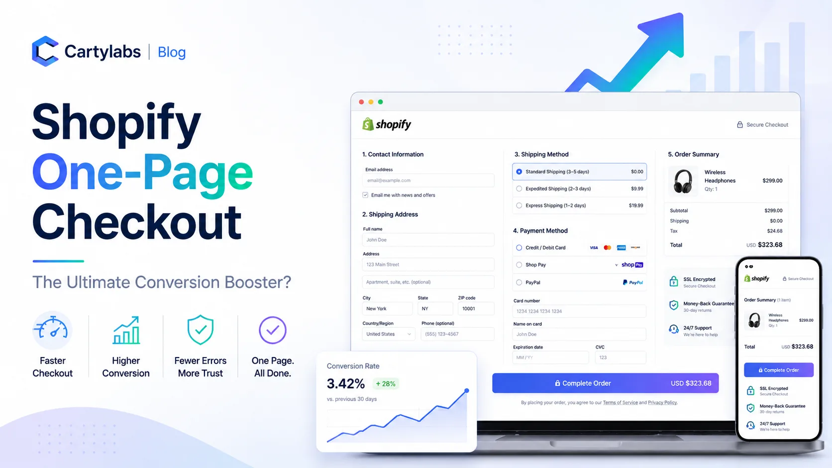
One-page checkout puts contact, shipping, and payment fields on a single scrollable page with the order summary persistent on the right rail (desktop) or collapsed at the top (mobile). Multi-step splits the same fields across three or four sequential pages.
Shopify rolled out one-page as the default in 2024 and now positions it as the recommended format for almost all stores. The exceptions are narrow and worth understanding.
The conversion case for one-page
The argument for one-page rests on three claims, each backed by Shopify’s own published data and our independent tests:
- Fewer page loads means lower drop-off (every additional page load loses two to four percent of visitors)
- Lower cognitive load (the buyer sees the whole task at once)
- Faster perceived speed (one continuous scroll feels quicker than three loads)
On stores with simple checkouts (one currency, no B2B fields, no custom apps), one-page typically lifts completion two to seven percent over multi-step.
When one-page underperforms
The argument against is more subtle. One-page can underperform multi-step in three situations:
- Heavy field requirements (B2B fields, tax IDs, dietary restrictions, custom apps that inject inputs)
- Long, complex shipping rules (real-time carrier calculation across many options)
- Older mobile devices (long scrollable forms with live validation can stutter)
In these cases the one-page form gets long, the persistent order summary fights for vertical space, and mobile completion drops. Multi-step’s chunking reads as progress and reassurance.
Mobile is the deciding factor
Most Shopify traffic is mobile. One-page on mobile is essentially a long scroll with a collapsed order summary at the top and a sticky CTA at the bottom. When it works, it works beautifully. When it breaks (often due to a misconfigured app or a heavy custom font), it breaks badly.
Test your one-page checkout on a real older mid-range Android device (not just Chrome DevTools) before deciding it is faster than multi-step. The performance gap between flagship iPhone and median Android is wider than designers tend to remember.
The customer-segment effect
First-time buyers behave differently than returning buyers on each format. Returning buyers complete faster on one-page because they recognize the layout and Shop Pay autofills most of it. First-time buyers can show no significant difference, or even slight preference for multi-step, because the chunked format feels less overwhelming.
This means your “is one-page better” answer depends on the ratio of new to returning traffic. Stores with high repeat rates benefit more from one-page.
How to test it on your own store
Do not assume. Run the test:
- Note your current checkout completion rate by step
- Switch checkout format (Settings > Checkout)
- Hold for fourteen days minimum
- Compare overall completion, segmented by device and buyer type
- Switch back if the new format does not win in your real data
Fourteen days is the minimum for any checkout test because conversion rate naturally fluctuates day to day and you need enough sessions per device type for the comparison to be meaningful.
The Shopify Plus angle
Shopify Plus merchants can build custom one-page checkouts with the Checkout UI Extensions framework. Plus stores often outperform the standard one-page because they can selectively add or remove fields and surface dynamic personalization (loyalty balance, store credit, B2B pricing) inline. For high-AOV stores, this is where the real conversion lift lives. See our Shopify Plus checkout optimization guide.
The verdict
One-page checkout is the right default for almost every Shopify store in 2026. It is not a universal conversion booster, but the conditions under which multi-step wins are narrow and identifiable. Test before you decide, and segment by device and buyer type when you read the results.
If you are running one-page and want to keep the cart and pre-checkout experience equally streamlined, Cartylabs ships a fast, branded cart drawer that hands off to one-page checkout without breaking flow.
Next steps
Related Shopify resources
Practical tools and product pages related to this guide.
Keep reading
All articles →
Guest Checkout vs. Account Creation on Shopify: Which Wins in 2026?
Should you force account creation or offer guest checkout on Shopify? Data-backed comparison of conversion, retention, LTV, and the hybrid post-purchase signup pattern that beats both.
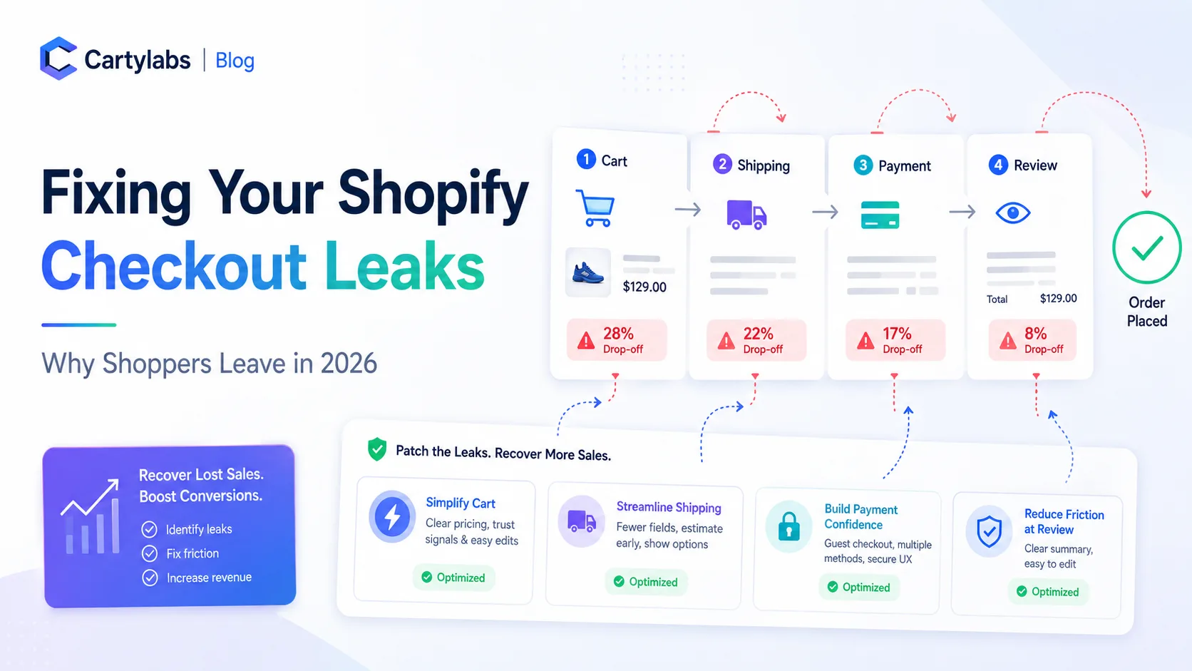
Why Shoppers Leave: Fixing Your Shopify Checkout Leaks in 2026
Diagnose Shopify checkout drop-off step by step using a leak-detection framework that maps abandonment causes to specific UX fixes for cart, shipping, payment, and review screens.
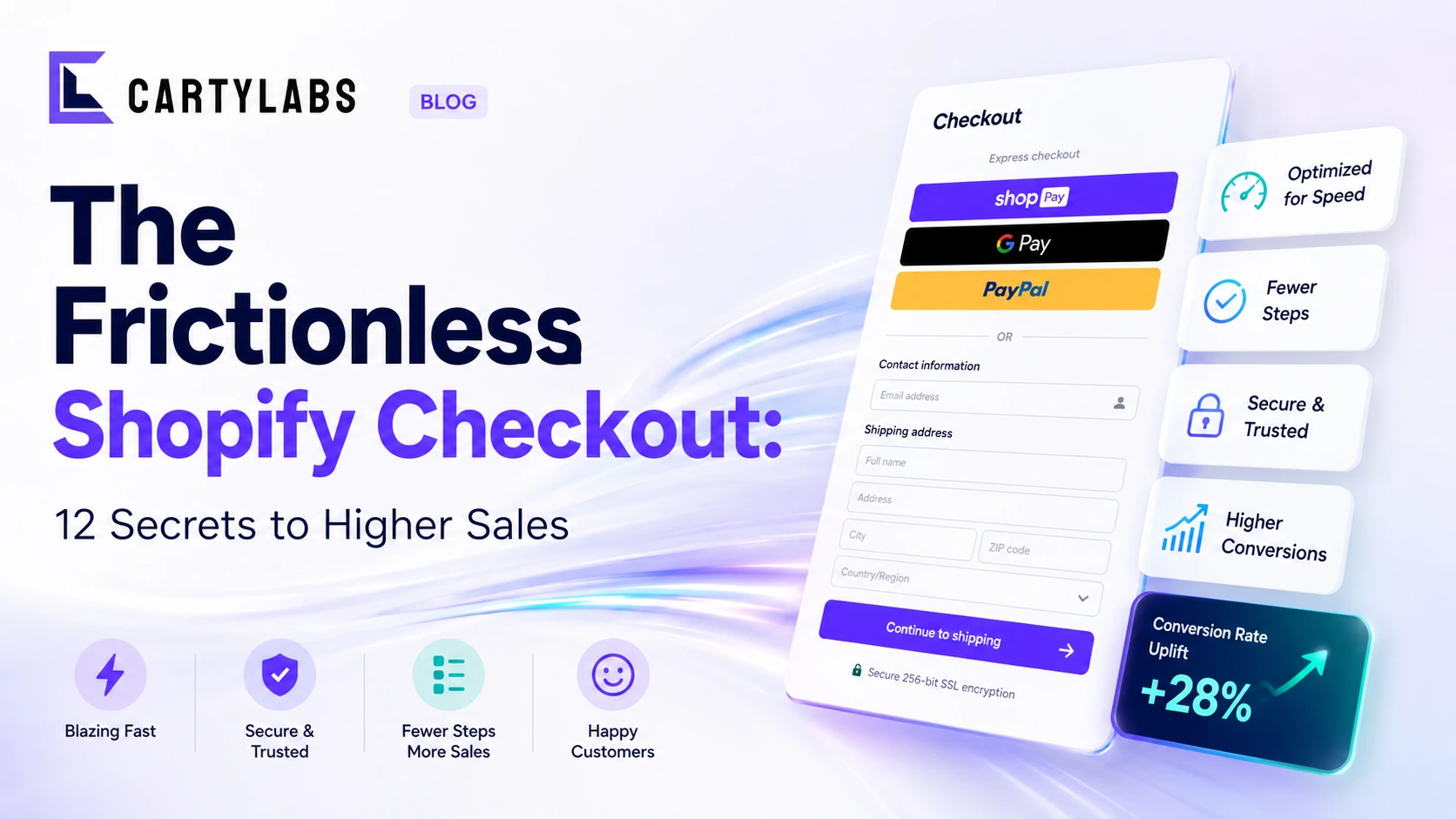
The Frictionless Shopify Checkout: 12 Secrets to Higher Sales
Build a frictionless Shopify checkout with twelve advanced tactics across form design, payment surfacing, dynamic shipping, and intelligent default selection that quietly compound conversion.
 Install Cart — Free