
The Psychology of the Checkout: Why Simple Beats Shiny on Shopify
Apply behavioral psychology to Shopify checkout: cognitive load, loss aversion, default bias, and choice architecture explain why simple checkouts convert better than visually impressive ones.

In this article
- 01 The buyer’s brain at checkout#
- 02 Principle 1: cognitive load is the enemy#
- 03 Principle 2: loss aversion runs the show#
- 04 Principle 3: default bias is the strongest lever#
- 05 Principle 4: choice overload kills decisions#
- 06 Principle 5: the IKEA effect inverts at checkout#
- 07 Principle 6: progress signals reduce perceived time#
- 08 Principle 7: the peak-end rule shapes memory#
- 09 Principle 8: trust is built in seconds and lost in milliseconds#
- 10 Why “shiny” loses#
Every year a new Shopify theme launches with a “stunning” checkout experience full of animations, micro-interactions, and visual flourishes. Every year those themes underperform plain, boring checkouts by measurable margins. The reason is not that buyers do not appreciate design. The reason is that the brain at the checkout step is doing risk evaluation, not aesthetic evaluation, and shiny designs add cognitive load to a task the buyer wants to complete with zero cognitive load.
This post walks through the behavioral psychology of Shopify checkout and the principles that explain why simple beats shiny every time.
For the practical UX principles these psychology effects produce, see the Shopify checkout UX best practices post.
The buyer’s brain at checkout
A buyer at checkout is in a specific cognitive state called “narrow focus.” They have made the purchase decision (or mostly made it) and are now executing a task. Their working memory is loaded with: their card details, their address, their email password, the question of whether they really need this item, the question of whether the shipping is reasonable, and the awareness that they are about to spend money.
Adding anything else (visual noise, decorative animations, secondary offers, optional newsletter signups) is asking the buyer to allocate working memory to something other than completing the task. The brain responds by deferring the task entirely. This is abandonment.
Principle 1: cognitive load is the enemy
Every visual element, every required field, every choice, and every microcopy line consumes a fraction of the buyer’s working memory. The total budget is small. The merchant who spends it most efficiently wins.
Practical implication: strip every element from checkout that does not contribute to completing the purchase. Newsletter checkboxes, social media icons, secondary CTAs, decorative imagery, and explainer copy all consume budget.
Principle 2: loss aversion runs the show
Behavioral economists have found that the pain of losing twenty dollars is roughly twice the pleasure of gaining twenty dollars. At checkout this shows up as: a surprise five-dollar shipping fee feels like losing five dollars, even though the buyer is gaining a product they wanted.
Practical implication: surface every cost as early as possible so the buyer absorbs the loss outside the checkout decision. By the time they reach payment, the cost should be a confirmation, not a surprise. See the Shopify free shipping bar strategy post for the surfacing pattern.
Principle 3: default bias is the strongest lever
Humans accept defaults at rates far above what rational choice would predict. A pre-checked subscription opt-in gets accepted by twenty to forty percent of buyers; a manually toggled one gets accepted by two to five percent.
Practical implication: defaults are the highest-leverage design choice in checkout. Set the cheapest acceptable shipping option as the default. Set Shop Pay as the default payment method for signed-in buyers. Set the country to geo-IP. Do not default opt-ins that the buyer would not actively choose (this damages long-term trust).
Principle 4: choice overload kills decisions
The classic jam-shop study showed buyers presented with twenty-four jams bought less often than buyers presented with six. The same effect runs at checkout. Eight shipping options is fewer orders than two. Ten payment methods is fewer orders than four.
Practical implication: prune your shipping and payment options to the smallest set that covers actual buyer preference. Surface the rest behind a “More options” toggle.
Principle 5: the IKEA effect inverts at checkout
On product pages, asking buyers to participate (configure, customize, build) increases perceived value. At checkout, the opposite is true: every action the buyer has to take feels like an obstacle. Checkout should feel like the system is doing the work, not the buyer.
Practical implication: pre-fill everything legally possible. Auto-apply discounts from referral links. Skip the country selector with geo-IP. Express checkout (Shop Pay one-tap) is the purest expression of this principle.
Principle 6: progress signals reduce perceived time
Whether through a “Step 2 of 3” indicator or a sticky order summary that shows progress, signaling where the buyer is in the flow reduces perceived wait time. The same checkout completion that feels long without progress signals feels short with them.
Practical implication: even one-page checkout benefits from a subtle progress indicator. A “Contact / Shipping / Payment” rail at the top of the page reads as orientation, not clutter.
Principle 7: the peak-end rule shapes memory
People remember an experience by its peak emotional moment and its ending. In checkout the ending is the Thank You page. A bad Thank You page (generic, dead-end) leaves the buyer with a flat memory of the entire purchase. A good Thank You page (warm, specific, with a clear next action) leaves them remembering the whole purchase positively.
Practical implication: invest disproportionately in the Thank You page. It costs your conversion rate nothing (the order is already complete) and it shapes the entire memory of the purchase, which drives repeat rate. The Shopify checkout post-purchase upsell guide covers what to put there.
Principle 8: trust is built in seconds and lost in milliseconds
A buyer takes about three seconds to evaluate trust at the payment step. A single misaligned font, a single missing payment logo, a single overconfident security badge can flip the evaluation negative in less time than that. Trust signals must be quietly consistent, not loud.
The Shopify checkout trust badges guide walks through what reads as trustworthy versus desperate.
Why “shiny” loses
A shiny checkout (with animations, color shifts, large hero imagery, decorative micro-interactions) violates several of these principles at once. It adds cognitive load, distracts from the primary action, and signals “designed by someone who wanted to win an award” rather than “designed for buyers who want to finish.”
The merchants with the highest-converting checkouts in 2026 ship the visually most boring checkouts: tight typography, generous whitespace, one primary action per step, defaults set well, trust signals where they need to be. Boring because boring works.
For the cart and pre-checkout half of the experience built on these same principles (low cognitive load, smart defaults, quiet trust signals), Cartylabs ships a cart drawer designed to disappear into the buying flow rather than compete with it.
Next steps
Related Shopify resources
Practical tools and product pages related to this guide.
Keep reading
All articles →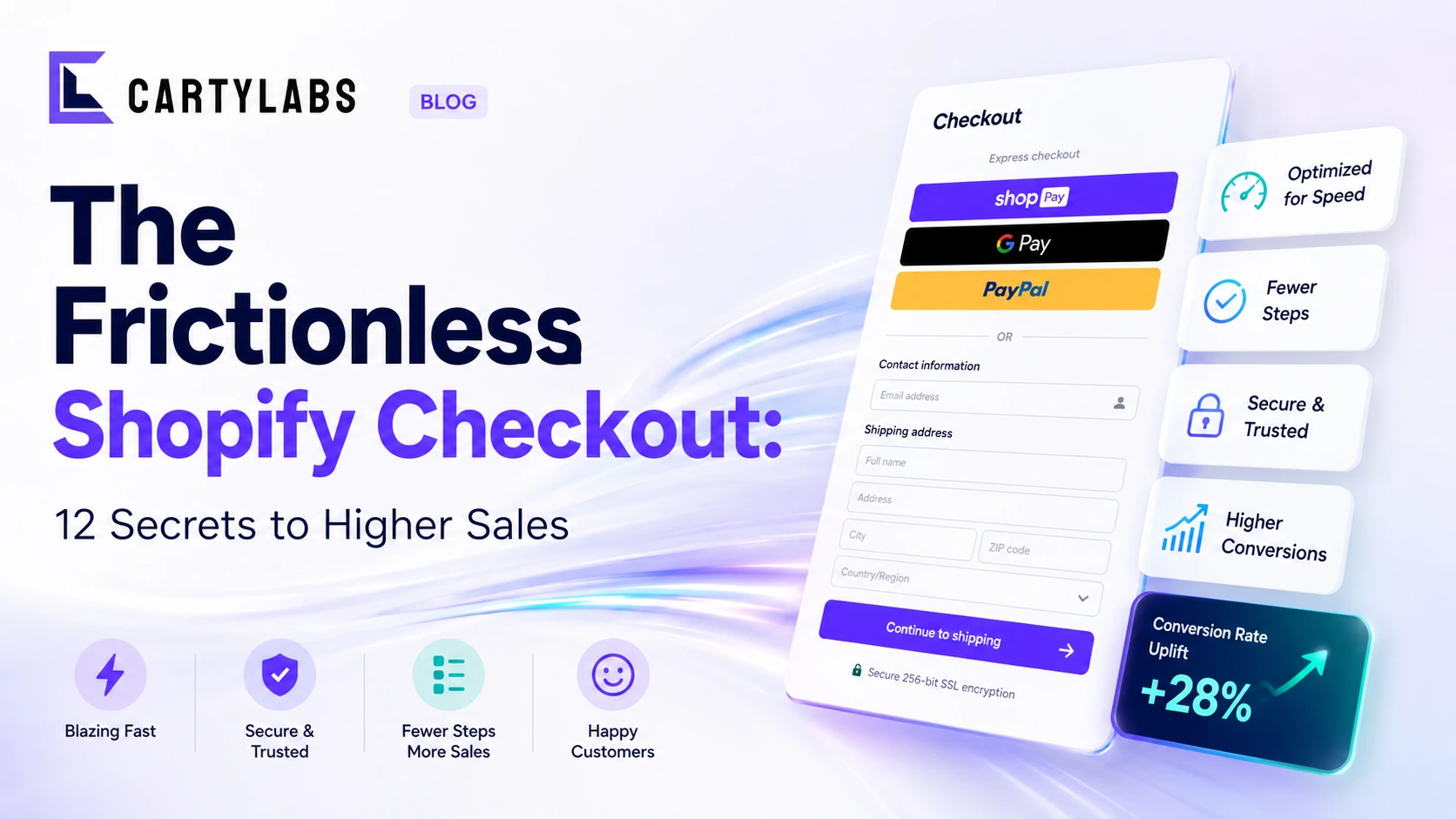
The Frictionless Shopify Checkout: 12 Secrets to Higher Sales
Build a frictionless Shopify checkout with twelve advanced tactics across form design, payment surfacing, dynamic shipping, and intelligent default selection that quietly compound conversion.
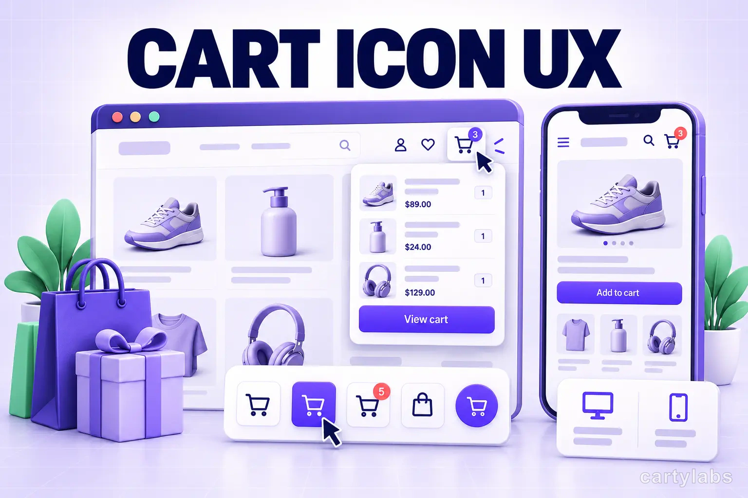
Cart Icon UX: 9 Patterns That Reduce Drop-Off
Shopify cart icon UX best practices: 9 patterns that reduce drop-off and lift cart re-engagement, with examples and conversion data from 2026.
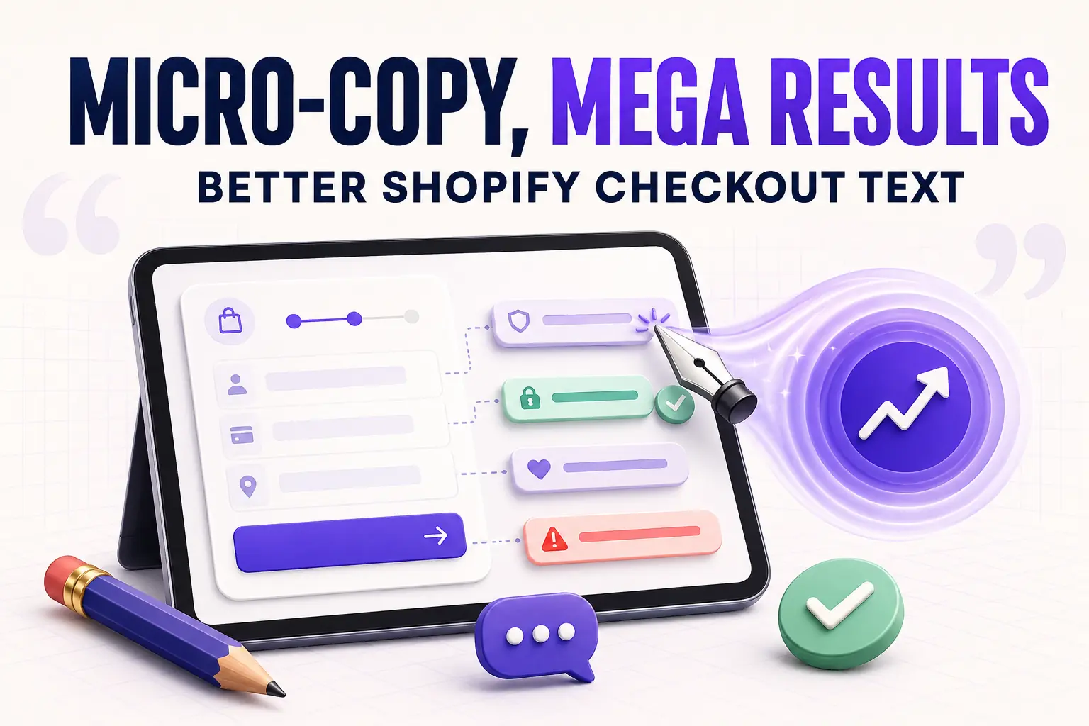
Micro-Copy, Mega Results: Writing Better Shopify Checkout Text
Master Shopify checkout micro-copy with specific examples for button labels, error messages, field hints, trust lines, and Thank You page text that quietly lifts conversion two to five percent.
 Install Cart — Free