Shopify Product Page Best Practices: 17 PDP Elements for 2026
What makes a high-converting Shopify product page? 17 PDP elements covering layout, social proof, copywriting, and trust, pulled from real audits.
In this article
The product page is the most important surface in your Shopify store. It’s where ad spend lands, where SEO traffic arrives, and where the buy decision is made. A 1% conversion lift on the PDP means a 1% revenue lift across the whole business.
This is a checklist of 17 elements that consistently appear on the highest-converting Shopify and Shopify Plus product pages we’ve audited. Some are obvious, some are subtle, but together they form the modern PDP playbook.
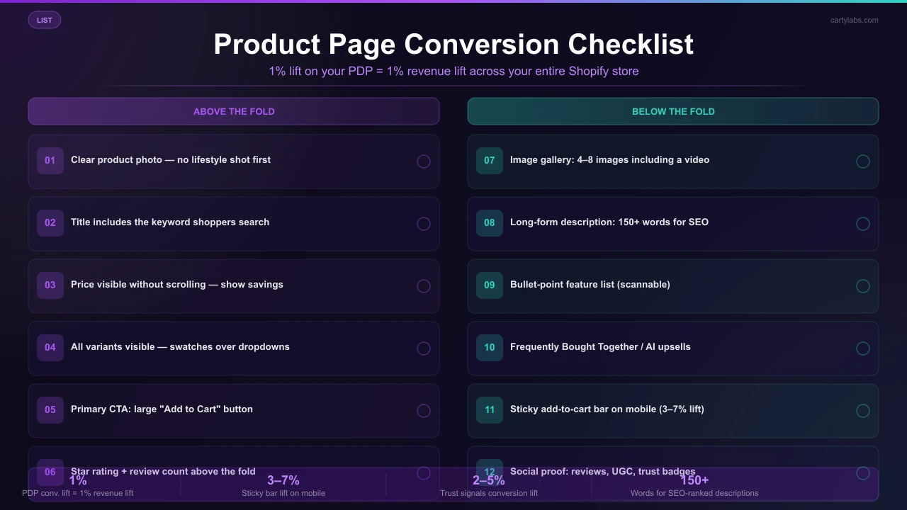
Above the fold (the first 100vh)
1. A clear product photo (not a lifestyle shot)
The first image should be the product, on a clean background, large. Lifestyle shots belong in the gallery, not the hero. Shoppers want to confirm “is this the right thing?” before they look at how it’s used.
2. Product title with the keyword
“Wool Running Socks, Crew, Merino Blend” beats “The Trailblazer.” Brand names get search demand only after years of marketing; keyword titles capture demand from day one.
3. Price (and original price if discounted)
Big, bold, and visible without scrolling. If discounted, show original strikethrough + savings (“Save $12 (25%)”). Concrete savings convert better than abstract “20% off” badges.
4. Variant pickers (with all variants visible)
Color swatches, size buttons. Avoid dropdown menus for variants. They hide options and slow decision-making. If you have 8+ variants, show the first 4-5 inline and offer a “view all” expand.
5. Primary CTA (Add to Cart)
Big, contrasting, full-width on mobile. Text should say “Add to Cart.” Not “Buy” (ambiguous), not “Submit” (form-y), not anything cute.
6. Secondary CTA (Buy Now / Express Buy)
For shoppers ready to skip the cart. A second button below or beside Add to Cart. See our Quick Buy guide for the full pattern, and pair it with a sticky add-to-cart bar on mobile.
7. Star rating + review count
Below the title, before the price. ”★★★★★ 4.8 (1,247 reviews)” is one of the highest-impact trust elements on a PDP. Make it clickable so it scrolls to the reviews section.
8. Stock urgency (only when honest)
“Only 3 left” is effective, but only when there really are only 3 left. Faking stock urgency is the #1 brand-trust killer on PDPs.
Below the fold
9. Image gallery (4-8 images, including a video)
Mix of:
- Product on white background (1)
- Lifestyle / in-use (2-3)
- Close-up of materials or texture (1-2)
- Scale shot (next to a hand or familiar object) (1)
- 15-30 second video (1), which converts at 2-3x photo-only PDPs
10. Long-form description (150+ words)
Three paragraphs minimum. Cover:
- What it is (product description, materials)
- Who it’s for / what problem it solves (use cases)
- What’s in the box / what to expect (sizing, care, ship time)
Skip generic marketing copy. Concrete details outperform adjectives.
11. Bullet-point feature list
Above the description, a 4-6 bullet list of key specs/benefits. Mobile shoppers scan; bullets capture them.
12. Sticky add-to-cart bar (mobile)
When the shopper scrolls past the buy box, a sticky bar appears at the bottom with the variant, price, and Add to Cart button. Lifts mobile add-to-cart 3-7%.
13. Frequently bought together
A bundle widget below the description offering 1-3 complement products at a small bundle discount. Lifts AOV 10-18% when paired well.
14. Reviews section with photos
Customer reviews with star rating, written feedback, and (critically) photos. Photo reviews convert at 2-4x text-only reviews. Most modern review apps (Judge.me, Stamped, Yotpo, Loox) capture these by default.
15. FAQ section
5-10 anticipated questions: sizing, care, shipping, returns, materials. Answers reduce support tickets and surface objections before they cost a sale.
16. Trust badges
Above the buy button or in the footer:
- Free shipping over $X
- Easy returns
- Secure checkout (Shop Pay logo + Visa/MC/Apple Pay icons)
- Made in [country] (if relevant)
- Material certifications (if relevant)
17. Recently viewed / related products
At the very bottom of the page. Catches shoppers who got close but didn’t convert on this product and gives them a path to a similar option without leaving the store.
Mobile-specific PDP rules
A few rules that only apply to mobile:
- Buy box should fit one viewport. Title, image, price, variant picker, and Add to Cart should all be visible without scroll.
- Variant pickers as buttons, not dropdowns. Tap-to-select beats tap-to-open-dropdown-tap-to-select.
- Reviews should be expandable, not paginated. No “page 2 of 47.”
- Accordion the description, FAQ, and shipping. Mobile shoppers scan; let them expand what they care about.
- Sticky add-to-cart bar always. Non-negotiable.
What hurts PDPs
Patterns that consistently underperform:
Carousels above the fold. Shoppers don’t see past the first slide.
Auto-playing video with sound. Annoying, accessibility nightmare, mobile-data-hostile.
Pop-up email capture on PDP load. Kills the buy intent. If you must capture emails, do it on the cart abandonment exit-intent.
Generic stock photos. Shoppers reverse-image-search; if the photo appears on 10 other stores, trust collapses.
Hidden shipping cost. Always include a “ships in 2-3 days · free over $50” line near the buy button.
Reviews tabbed away. Even if your reviews are great, hiding them behind a tab cuts visibility 60-80%.
Long product titles that wrap onto 3 lines on mobile. Truncate or shorten.
Page speed matters more than design
The single biggest PDP conversion lift in our data comes not from any individual design element but from page speed. A PDP that loads in 1.2 seconds converts ~40% better than the same PDP loading in 4.5 seconds.
The usual culprits on slow Shopify PDPs:
- Unoptimized hero images
- Third-party app scripts loading synchronously
- Large embedded video files
- Web fonts blocking render
- Heavy theme JS (especially older themes)
Run PageSpeed Insights on a representative product page monthly. Target LCP under 2.5s and CLS under 0.1.
Measuring PDP performance
Track per-product:
| Metric | Healthy range |
|---|---|
| Add-to-cart rate | 5-12% |
| PDP conversion rate (visit → order) | 2-4% |
| Bounce rate | under 50% |
| Time on page | >40 seconds |
| Reviews-section scroll-to rate | >40% |
Look at your top 20 PDPs by traffic and rank them by add-to-cart rate. The bottom-quartile pages are usually the highest-leverage opportunities for the changes above.
A short summary
A high-converting Shopify product page isn’t about clever design. It’s about consistent execution of 15-20 well-known elements: clean photos, keyword-rich title, prominent price, reviews above the fold, sticky add-to-cart on mobile, fast load time, and a real long-form description.
Audit your top 10 PDPs against this checklist. The fixes that score “no” are your roadmap.
Want a sticky add-to-cart bar live on your PDPs this afternoon? Install Cartylabs free on Shopify.
Learn more: Shopify upsell app, Shopify sticky cart
Keep reading
All articles →
Shopify One-Page Checkout: The Ultimate Conversion Booster?
Does Shopify one-page checkout actually beat multi-step in 2026? A data-backed look at conversion gains, mobile trade-offs, and exactly when to switch your store.
How to Turn Cart Additions Into Completed Sales on Shopify
Convert more Shopify cart additions into completed sales with proven tactics for reducing cart-to-checkout drop-off, optimizing the cart drawer, and timing reassurance messaging.
Why Shoppers Leave: Fixing Your Shopify Checkout Leaks in 2026
Diagnose Shopify checkout drop-off step by step using a leak-detection framework that maps abandonment causes to specific UX fixes for cart, shipping, payment, and review screens.