Shopify Cart Drawer: Complete Guide to Slide-Out Carts
A Shopify cart drawer keeps shoppers browsing instead of bouncing. Learn how slide-out carts boost conversion and how to ship one in 5 minutes.
In this article
- 01 What is a Shopify cart drawer?#
- 02 Why a cart drawer outperforms the default Shopify cart page#
- 03 What belongs inside a Shopify cart drawer#
- 04 Sticky-cart and slide-out: how they work together#
- 05 Shopify cart drawer best practices#
- 06 Mobile cart drawer: the part most stores get wrong#
- 07 How to add a cart drawer to your Shopify store#
- 08 Measuring whether your cart drawer is working#
- 09 A short summary#
The default Shopify cart is a dead end. A shopper clicks “Add to cart” and gets sent to a separate /cart URL, away from the product they were just enjoying. To keep shopping, they have to find the back button, and a measurable share of them simply don’t.
A Shopify cart drawer fixes this. It’s a slide-out panel that opens in-page when shoppers add an item, lets them review the cart, then disappears so they can keep browsing. In our data across 1,000+ Shopify stores, swapping the default cart page for a drawer lifts cart-to-checkout conversion 5-12% on its own.
This guide covers what a Shopify cart drawer is, why it works, what belongs inside one, and how to ship one without touching theme code.
What is a Shopify cart drawer?
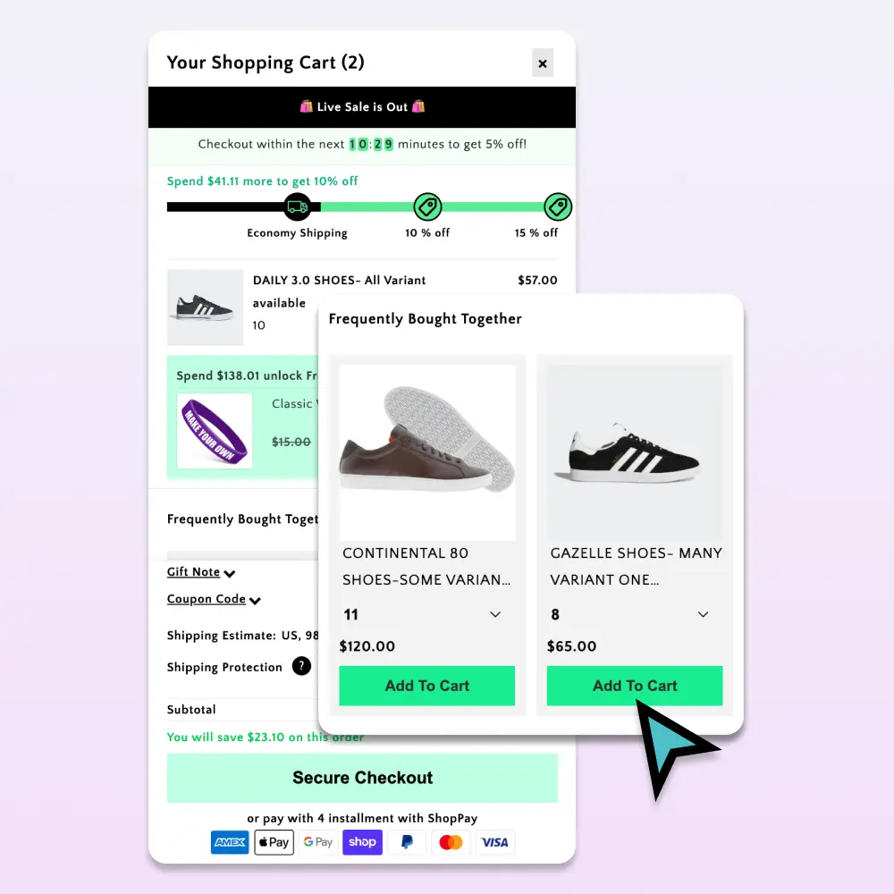
A cart drawer (also called a slide-out cart, side cart, or mini cart) is a panel that slides in from the side of the screen, usually the right, when a shopper adds a product. It contains:
- The line items currently in the cart
- Quantity controls and a remove button
- Subtotal, shipping notes, and a checkout button
- Optional: upsell recommendations, a rewards progress bar, gift notes, promo codes
It’s essentially the cart page, except it doesn’t take the shopper away from the product page.
Why a cart drawer outperforms the default Shopify cart page
Three reasons:
1. It preserves browse context. The shopper’s product page is still under the drawer. When they close it, they’re back where they started, and 25-40% of shoppers add a second item from the same browse session.
2. It removes a navigation step. The classic flow is: PDP → cart page → “Continue shopping” → back to category. The drawer flow is: PDP → drawer → close → keep browsing. One step instead of three.
3. It puts the upsell at the moment of intent. A cart drawer is the only surface where a shopper has just committed to a purchase. That’s the highest-intent micro-moment in your funnel, and the place where a relevant upsell or reward unlock has the highest conversion rate.
What belongs inside a Shopify cart drawer
Order matters. From top to bottom:
- Cart count + close button (so shoppers can dismiss without scrolling)
- Rewards progress bar (“$12 to free shipping”)
- Line items with image, variant, qty controls, and a small remove icon
- Upsell recommendations (“Customers also added”)
- Promo code field (collapsed, optional)
- Subtotal + estimated shipping line
- Checkout button (large, contrasting, full-width)
- Trust microcopy (“Secure checkout · Free returns · Ships in 2 days”)
What doesn’t belong: long-form descriptions, blog post recommendations, anything that competes with the checkout CTA.
Sticky-cart and slide-out: how they work together
The cart drawer is one half of a complete cart UX. The other half is a sticky cart icon, a persistent floating button (usually bottom-right on mobile, top-right on desktop) that shows the current item count and reopens the drawer with one tap.
Together they solve a subtle problem: shoppers who navigate away from the drawer (to compare items, search Google, etc.) can return to their cart with one click instead of digging through nav.
Shopify cart drawer best practices
A short list of patterns that work, drawn from auditing hundreds of Shopify stores:
- Open the drawer automatically on add-to-cart. Don’t make shoppers click a cart icon to confirm.
- Show a thumbnail per line item. Text-only line items feel cheap and increase removal rate.
- Make the checkout button at least 48px tall on mobile. Apple’s HIG minimum is 44px; 48 is safer with thumb error margins.
- Keep the upsell carousel to 3-4 items max. Beyond that, shoppers stop scanning and start ignoring.
- Surface auto-applied discounts as line items. Shoppers want to see the discount land rather than have it disappear into a subtotal.
- Don’t lazy-load the drawer. Pre-render it on page load so it opens instantly. A 300ms delay between click and drawer-open kills conversion.
Mobile cart drawer: the part most stores get wrong
70% of Shopify traffic is mobile, but most cart drawers are designed for desktop and “made responsive” as an afterthought. A few mobile-specific rules:
- Slide in from the right, full-width. Don’t try to keep the underlying page visible. The screen is too small.
- Add swipe-to-close from the right edge. Shoppers expect this on iOS; not having it feels broken.
- Sticky checkout button at the bottom. When the cart has 4+ items, the checkout button scrolls off-screen if it’s not pinned.
- Test the keyboard avoidance. When shoppers tap the promo code field, iOS Safari raises the keyboard and often hides the checkout button. Make sure the drawer scrolls correctly.
How to add a cart drawer to your Shopify store
You have three options:
Option A: Custom-build one. Realistic for stores with a dedicated front-end developer. Expect 1-2 weeks of design + dev + QA. Plan for ongoing maintenance every time you update your theme.
Option B: Use a single-purpose cart drawer app. Most charge $20-30/month and handle the drawer well, but they don’t include upsells, rewards, or sticky-cart, so you end up stacking 3-4 apps.
Option C: Use an all-in-one cart app. Tools like Cartylabs ship the drawer plus sticky cart, AI upsells, free-gift rewards, countdowns, and analytics in one Shopify App Embed. Setup is roughly two minutes: toggle the features on, style them to match your brand, and save.
Measuring whether your cart drawer is working
Three metrics tell the story:
| Metric | Target | Why it matters |
|---|---|---|
| Cart-to-checkout rate | >50% | If drawer is good, fewer shoppers bounce here |
| Items per cart | +0.3 vs. baseline | Good drawers + upsells lift basket size |
| Time to checkout | under 90 seconds | Friction shows up here |
Most Shopify analytics tools give you the first two. Built-in cart analytics (in Cartylabs and similar apps) give you the third.
A short summary
A Shopify cart drawer is the highest-leverage UX change most stores can make. It costs nothing to ship if you use an all-in-one app, takes about two minutes to install, and pays for itself in the first week through recovered cart conversions.
Pair it with a sticky cart icon, a stacked rewards bar, and AI upsells, and you’ve built the modern Shopify cart without the legacy cart-page detour.
Want to see it on your store? Install Cartylabs free on Shopify, or book a 15-minute demo and we’ll walk through the setup.
Learn more: Shopify cart drawer app, Shopify upsell app
Keep reading
All articles →1-Click Checkout: The Shopify Merchant's Secret Weapon for Sales
Enable 1-click checkout on Shopify with Shop Pay, Apple Pay, and Google Pay to convert returning buyers in under three seconds. Setup, placement, conversion math, and the apps that extend it beyond Shop Pay.
Guest Checkout vs. Account Creation on Shopify: Which Wins in 2026?
Should you force account creation or offer guest checkout on Shopify? Data-backed comparison of conversion, retention, LTV, and the hybrid post-purchase signup pattern that beats both.
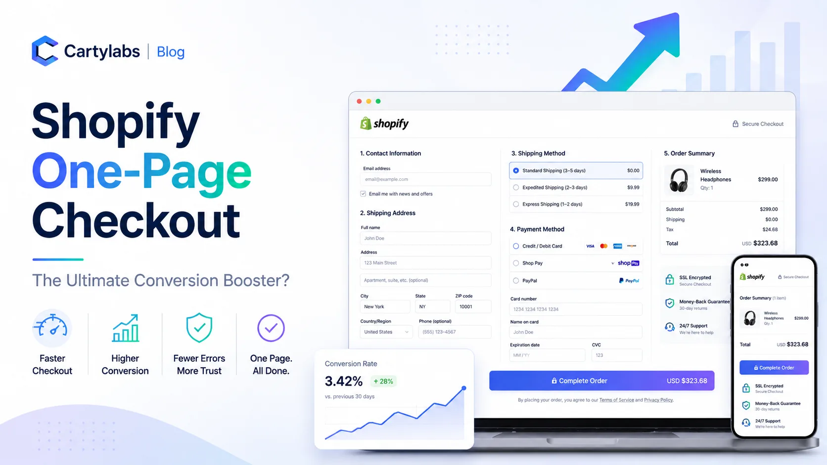
Shopify One-Page Checkout: The Ultimate Conversion Booster?
Does Shopify one-page checkout actually beat multi-step in 2026? A data-backed look at conversion gains, mobile trade-offs, and exactly when to switch your store.