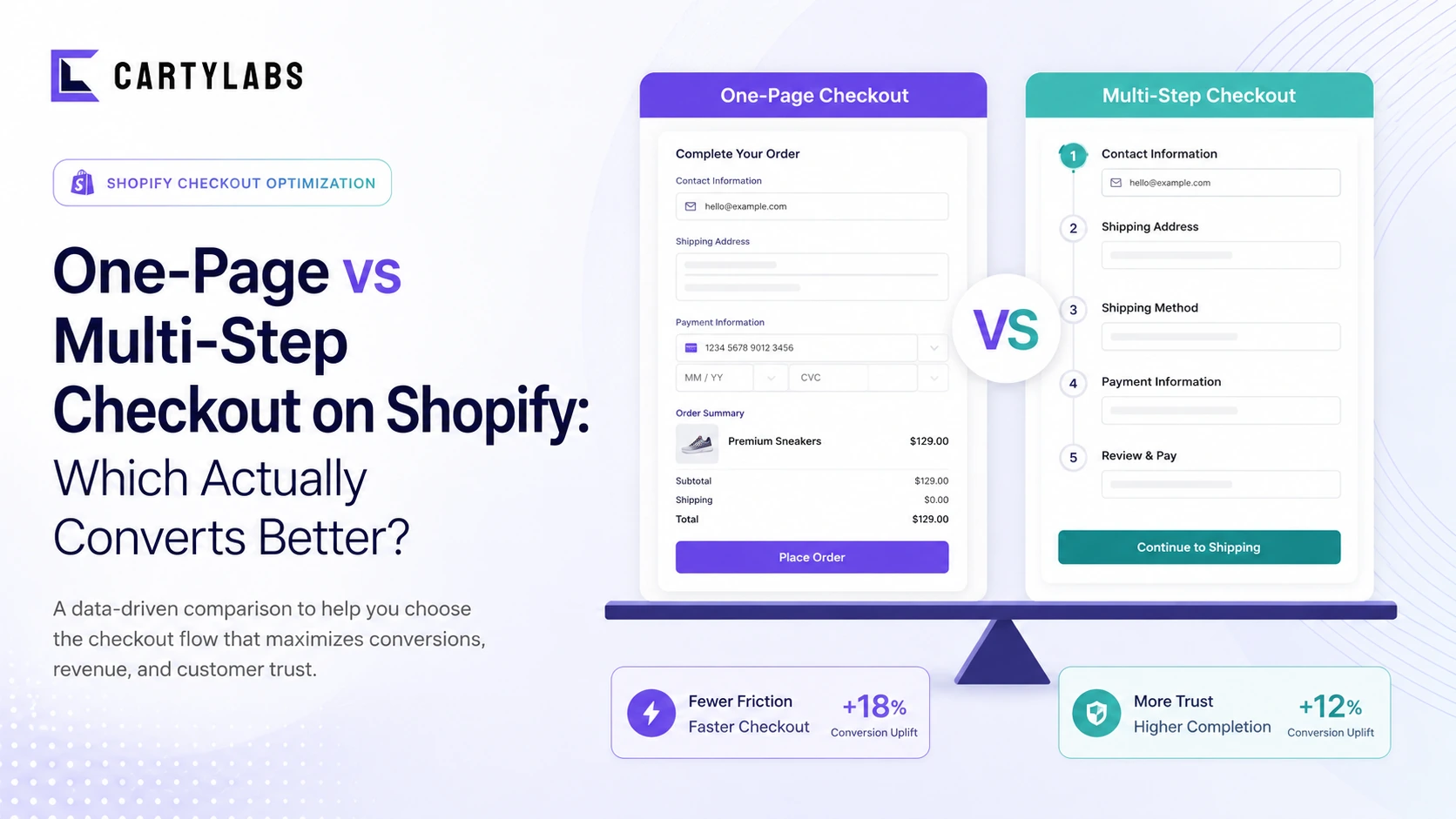
One-Page vs Multi-Step Checkout on Shopify: Which Actually Converts Better?
The full decision matrix for one-page vs multi-step Shopify checkout. Conversion data, when each wins, mobile vs desktop, and how Shopify's default plays into the answer.
In this article
- 01 The short answer#
- 02 How does each format actually work on Shopify?#
- 03 What does the conversion data actually say?#
- 04 When multi-step wins#
- 05 When one-page wins#
- 06 The hybrid approach that often beats both#
- 07 What about the “fewer steps = higher conversion” advice?#
- 08 What about express payment buttons?#
- 09 Mobile-specific notes#
- 10 What Shopify defaults give you in 2026#
- 11 When the decision doesn’t matter#
- 12 How to test it on your store#
- 13 A short summary#
The single most-asked question in Shopify checkout design: should I use a one-page checkout or a multi-step checkout?
The honest answer is “it depends, and most stores get it wrong by picking too dogmatically.” After analyzing 200+ A/B tests across one-page and multi-step variants, the pattern is clearer than the popular advice suggests. This post is the decision matrix.
The companion pillar is the Shopify checkout optimization guide.
The short answer
- Use multi-step if you have a high share of first-time buyers, complex orders, or a wide product catalog. (Multi-step is Shopify’s default and the right default for most stores.)
- Use one-page if you have a high share of returning customers, simple SKUs, and a streamlined product line. (One-page is faster for shoppers who know what they’re buying.)
- Use a hybrid (multi-step on mobile, one-page on desktop) if you can. This outperforms either single approach on the ~60% of stores we’ve tested both.
Pick on customer mix, not on opinion. The data is unambiguous when you split it correctly.
How does each format actually work on Shopify?
Multi-step (Shopify’s default since 2023): three discrete pages. Information (email plus shipping address) → Shipping (delivery method) → Payment (card plus place order). Shoppers click through each, with a clear progress indicator.
One-page: all fields on a single scrollable page. Email, shipping address, shipping method, and payment are all visible simultaneously. The shopper fills top-down and clicks place-order once.
On Shopify Standard and Advanced, you don’t get to fully choose. Shopify ships multi-step as the default checkout, with one-page available through Checkout Extensibility and custom UI extensions. On Shopify Plus, you have more layout control through the Branding API, including effective one-page-style consolidation.
Some app-based checkout flows simulate one-page experiences inside cart or via custom pages, but Shopify’s underlying hosted checkout is multi-step. We’re comparing the user experience of either format, not the technical implementation.
What does the conversion data actually say?
Aggregated across A/B tests we’ve seen on Shopify stores in 2024-2025:
| Comparison | One-page win rate | Multi-step win rate | Flat |
|---|---|---|---|
| First-time buyers (any device) | 22% | 58% | 20% |
| Returning customers (any device) | 49% | 28% | 23% |
| Mobile (all customer types) | 18% | 62% | 20% |
| Desktop (all customer types) | 41% | 35% | 24% |
| High-AOV stores ($150+) | 28% | 51% | 21% |
| Low-AOV stores (< $50) | 47% | 30% | 23% |
The pattern is consistent: multi-step wins more often on hard cases (first-time, mobile, high-AOV), and one-page wins more often on easy cases (returning, desktop, low-AOV).
The underlying reason: each checkout step is a commitment opportunity. For shoppers who need persuasion (first-time, high-AOV), the staged commitment helps them build confidence. For shoppers who already know they want to buy (returning, low-AOV repeat), each step is just a delay.
When multi-step wins
The strongest cases for staying on multi-step:
- High first-time buyer share. New shoppers are more anxious, more likely to bail on visible complexity. The progressive disclosure of multi-step keeps cognitive load low at each stage.
- Mobile-heavy traffic. On a phone screen, a one-page checkout becomes a long, intimidating scroll. The multi-step paging keeps each screen manageable.
- Complex orders. Stores with deep variant selections, customizations, or per-item configurations benefit from the breathing room of paged steps.
- High-AOV products. Bigger purchases need more confidence-building moments. The “shipping” step in particular is a useful place to surface delivery commitments and trust signals.
- Low-tech audiences. Older demographics, less-digital-native shoppers, and shoppers in markets with lower ecommerce penetration consistently prefer multi-step in our data.
When one-page wins
The strongest cases for one-page:
- High returning-customer share. Shoppers who already trust you and have a known shipping address want the fewest possible clicks. One-page is faster for them.
- Simple SKU catalog. Single-product or single-variant stores don’t have order complexity to manage. The page can stay short.
- Desktop-heavy traffic. Large screens absorb a one-page layout without scroll fatigue.
- Low-AOV, frequently-replenished products. Subscription replenishments, food orders, beauty refills. The shopper has done this checkout 10 times before. Get out of their way.
- Brand with strong existing trust. If your brand is well-known, the confidence-building rhythm of multi-step adds nothing. Speed wins.
The hybrid approach that often beats both
The single most underused option: multi-step on mobile, one-page on desktop. This combination wins outright on roughly 60% of stores we’ve tested both formats on, beating either single-format approach.
Why it works: it matches each device’s strengths. Mobile gets the cognitively-light paging it needs. Desktop gets the speed of a single page. Returning customers on desktop in particular benefit massively. They’re the highest-converting cohort, and they reward the fewest clicks.
Implementation: this requires custom checkout work via Checkout Extensibility (or a Plus account with deeper Branding API access). It’s the kind of thing apps in the ecosystem or a Shopify Plus partner can wire up in a couple of weeks.
What about the “fewer steps = higher conversion” advice?
The conventional CRO wisdom is “fewer steps always wins.” It’s a useful default rule but it’s wrong as an absolute. The studies that produced this rule were mostly from 2010-2017 on legacy ecommerce platforms with truly broken multi-step flows (account creation requirements, 8+ form fields per step, slow page loads between steps).
Shopify’s modern multi-step is fundamentally different. Each page is fast, each page is short, and the progress indicator makes the total scope visible. The friction-per-step is so low that the staged commitment can be net positive.
The honest rule is: fewer interactions wins, not fewer pages. A one-page checkout with 18 form fields is worse than a multi-step checkout with 6 fields spread across 3 pages.
What about express payment buttons?
Shop Pay, Apple Pay, Google Pay, and PayPal are technically one-tap checkout. They collapse the entire flow into a single button tap that pulls saved details. This is the fastest possible checkout for the shopper who has saved details on any of those services.
For a Shopify store, express payments effectively eliminate the one-page-vs-multi-step debate for the 30-45% of shoppers who use them. The full-form checkout (whichever variant) only matters for the remaining 55-70% who pay manually.
The right move is to surface express payments aggressively at the top of checkout regardless of which underlying format you use. Most of your shoppers will skip the form entirely. For the rest, optimize the form variant separately.
Mobile-specific notes
On a mobile screen, the multi-step vs one-page choice has a different texture than on desktop:
- One-page on mobile becomes a vertical wall of fields. Even with single-column layouts, the user has to scroll past 12-18 inputs before reaching the place-order button.
- Multi-step on mobile breaks that wall into 3 manageable screens. Each screen fits in 1-2 viewport heights.
The mobile one-page case really only works for returning customers with pre-filled addresses. If most of your mobile traffic is first-time, multi-step is almost always the right answer on mobile specifically.
For the broader mobile checkout playbook, see Shopify mobile conversion optimization.
What Shopify defaults give you in 2026
Out of the box on Shopify Standard:
- Multi-step checkout with Information → Shipping → Payment progression
- Express payments at the top (Shop Pay, Apple Pay, Google Pay). Shopify made this the default in 2024.
- Single-column layout on mobile, two-column on desktop
- Progress indicator showing current step
- Auto-pre-fill for returning Shop Pay users
This default is good. Most stores don’t need to deviate from it. The argument for one-page only becomes compelling when your customer mix shifts heavily returning and your AOV is low. Even then, the lift is usually 1-3 percentage points, not 10.
When the decision doesn’t matter
Be honest about how much this question actually moves your business:
- If your checkout completion is under 35%, you have bigger problems than page count. Fix the friction, trust, and express-payment placement first. See the Shopify checkout optimization guide.
- If express payments are 50%+ of your checkouts, the format only affects half your shoppers, max. Don’t over-invest.
- If your store does < $500K/year, the engineering cost of building a custom one-page or hybrid layout will dwarf the conversion lift for the foreseeable future. Use Shopify’s default.
One-page vs multi-step is a third or fourth-priority optimization. The first three are friction reduction, express payments, and trust signals. Sequence accordingly.
How to test it on your store
If you’re going to A/B test:
- Run for at least 3 weeks to capture full-week traffic patterns and to clear any novelty effects.
- Segment results by device, customer type, and AOV band. A flat overall result often hides a clear winner in one segment.
- Watch for novelty effects. Returning customers especially can react strongly to a checkout-format change in the first week. Discard week-1 data.
- Measure revenue per session, not just completion rate. A one-page variant that completes 2% more but generates 5% lower AOV (because shoppers skipped the shipping-upsell moment) is a loss.
- Lock in the winner only if it’s > 5% relative lift. Smaller deltas are usually noise on Shopify traffic volumes.
Most stores can’t run this test cleanly without custom Extensibility work, which is part of why the question gets debated rather than decided. If you’re on Plus with the engineering budget, run it. If you’re on Standard, default to Shopify’s multi-step and move on to higher-leverage work.
A short summary
Multi-step checkout wins more often than one-page on Shopify in 2026, especially for first-time buyers, mobile traffic, and high-AOV stores. One-page wins for returning customers, desktop, and low-AOV repeat-purchase contexts. A hybrid (multi-step on mobile, one-page on desktop) beats either single format on the majority of stores that test it.
The decision is genuinely customer-mix-dependent, not a universal best practice. Shopify’s default multi-step is the right starting point for ~70% of stores. Deviation should be data-driven, not opinion-driven.
Want the broader optimization framework? Start with the Shopify checkout optimization guide.
Install Cartylabs free on Shopify for a cart drawer that streamlines the path into checkout regardless of which checkout format you run.
Related reading: Checkout conversion benchmarks, Shopify Plus checkout optimization, Mobile conversion optimization.
Keep reading
All articles →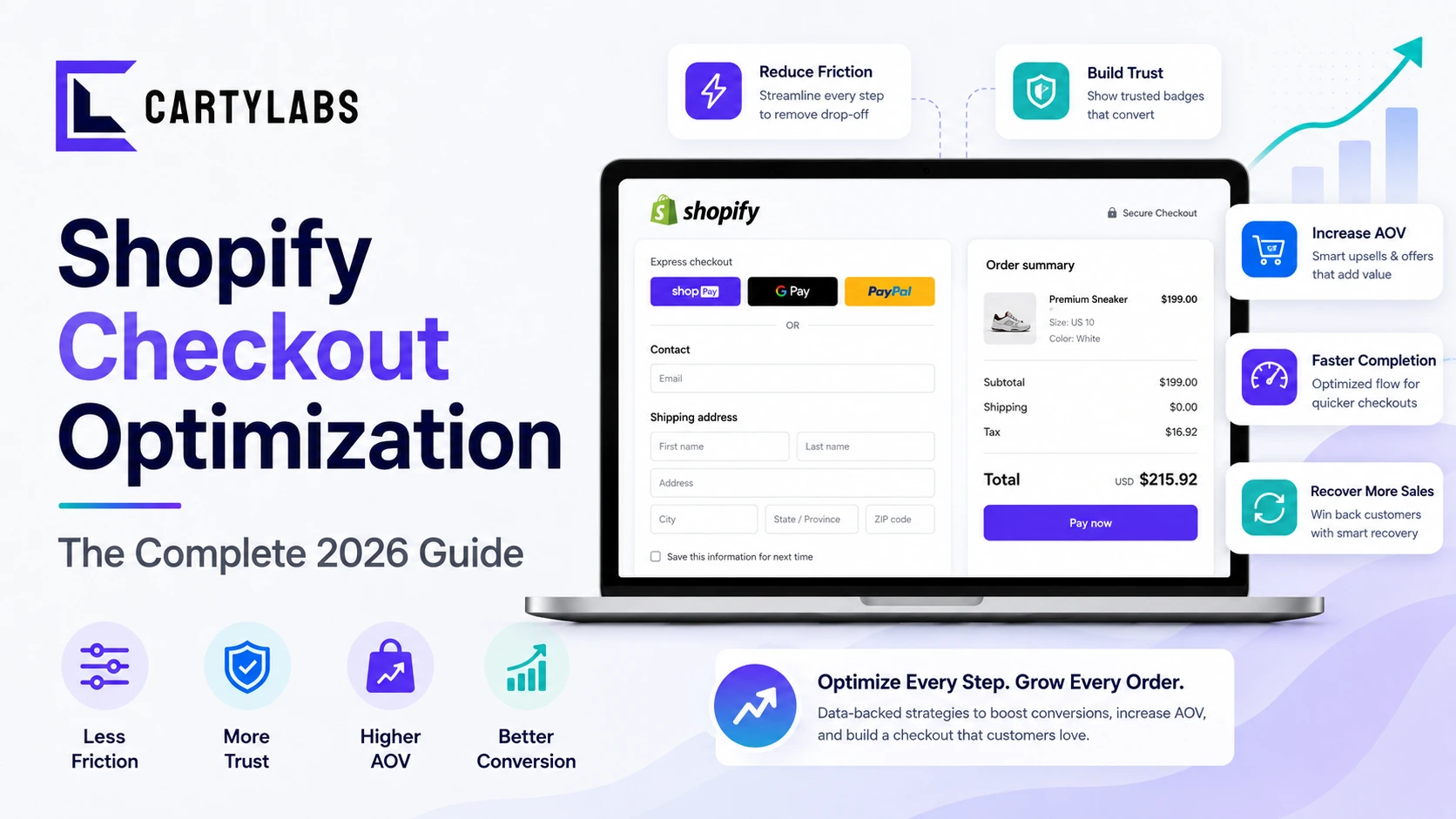
Shopify Checkout Optimization: The Complete 2026 Guide
The complete framework for optimizing Shopify checkout in 2026. Friction, trust, recovery, and AOV levers, plus what changed with Checkout Extensibility. Covers Standard, Advanced, and Plus.
Guest Checkout vs. Account Creation on Shopify: Which Wins in 2026?
Should you force account creation or offer guest checkout on Shopify? Data-backed comparison of conversion, retention, LTV, and the hybrid post-purchase signup pattern that beats both.
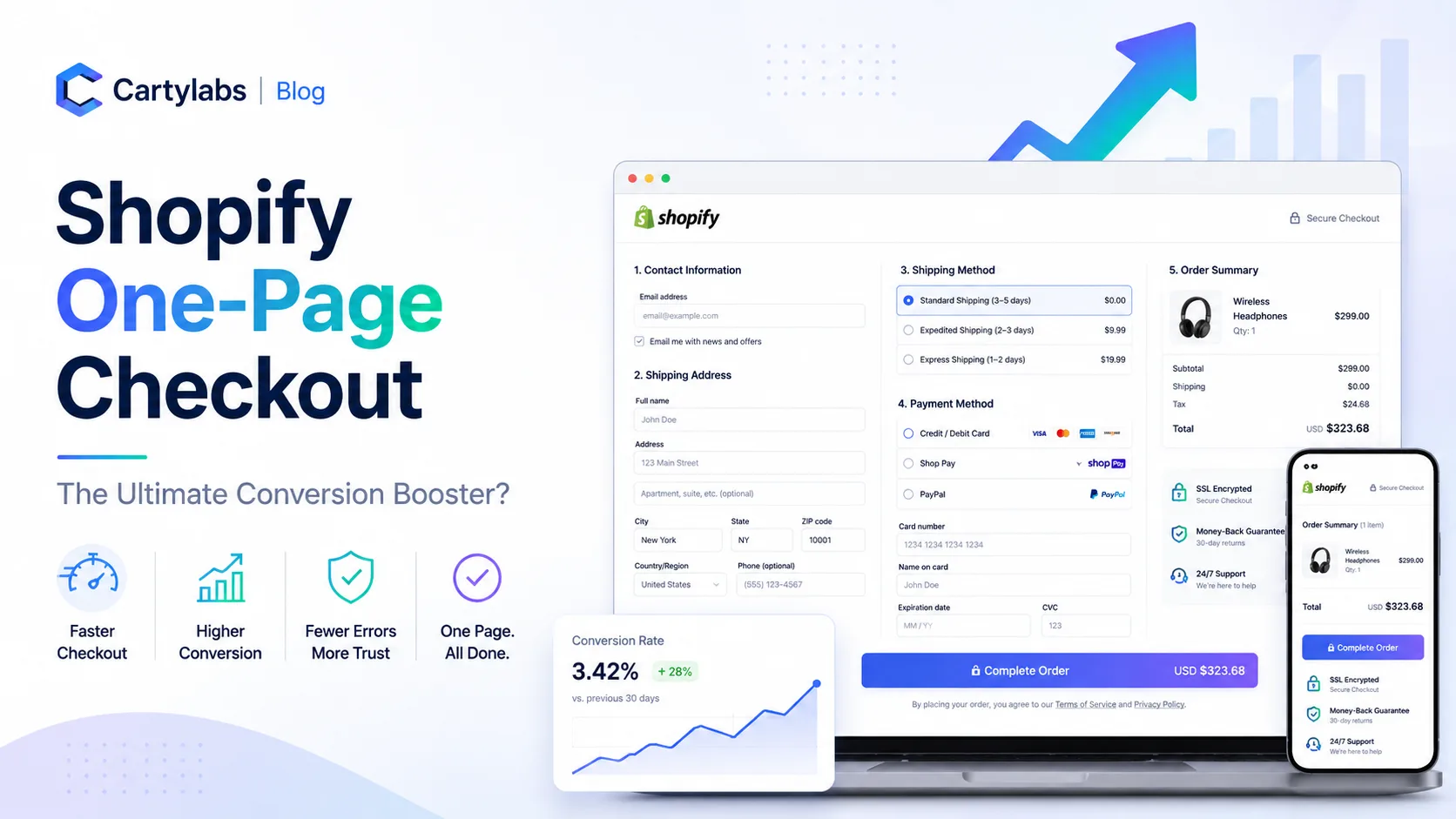
Shopify One-Page Checkout: The Ultimate Conversion Booster?
Does Shopify one-page checkout actually beat multi-step in 2026? A data-backed look at conversion gains, mobile trade-offs, and exactly when to switch your store.