
Trust Signals: Making Your Shopify Checkout Look Secure in 2026
Make your Shopify checkout look secure and convert better with the right mix of trust signals, payment logos, security badges, and reassurance copy that quietly closes the sale at the payment step.
In this article
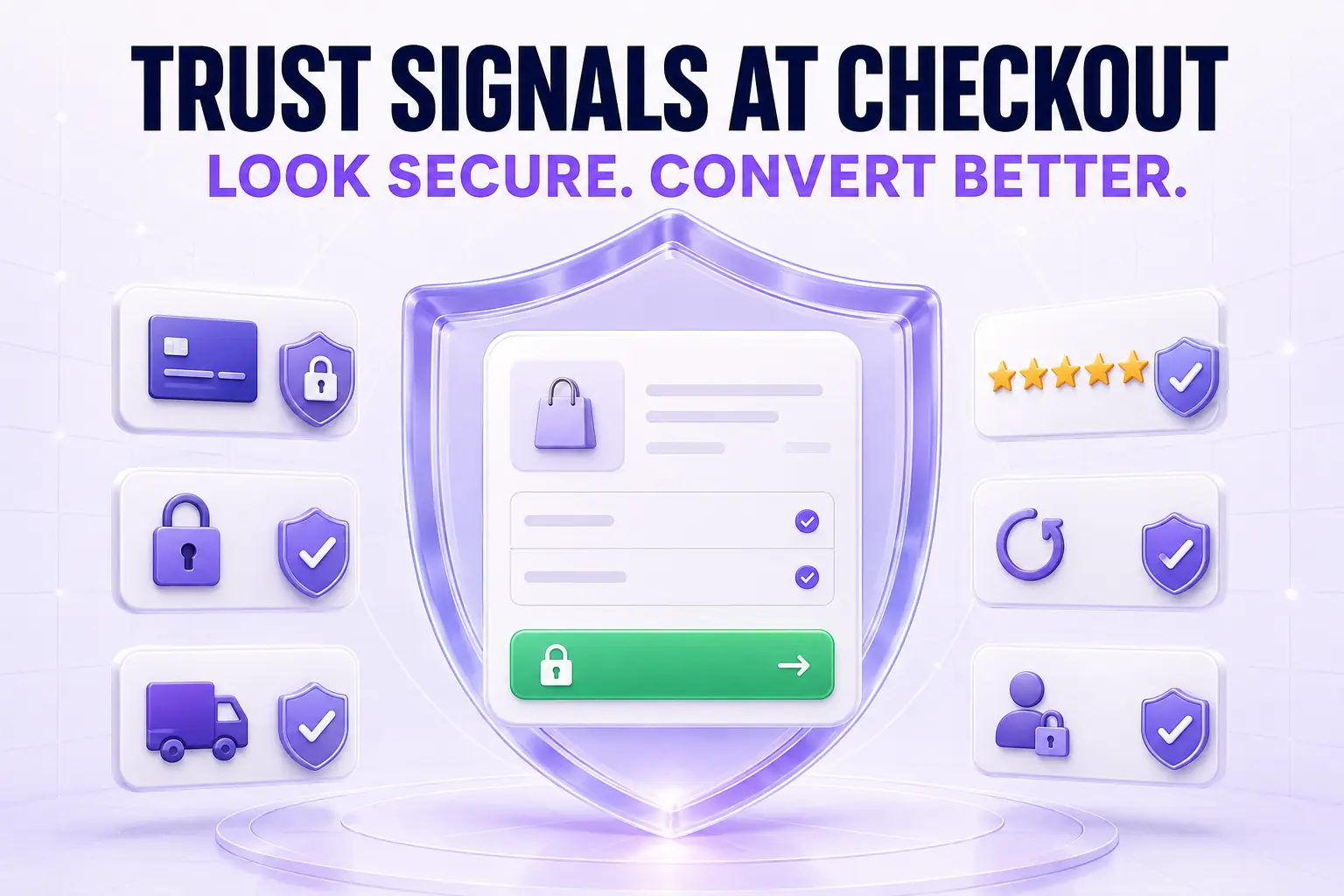
Trust at checkout is not a feeling. It is a series of small visual and textual cues the buyer reads in under three seconds before they decide to enter card details. Get those cues right and your payment-step completion rate moves up two to six percent without changing anything else. Get them wrong and you lose buyers who had every intention of paying.
This guide walks through what actually signals trust on Shopify checkout in 2026, what reads as desperate, and the placements that matter.
For the badge-specific deep dive, our Shopify checkout trust badges guide covers icon choice and design. For the broader UX context, the Shopify checkout UX best practices post puts trust signals in the bigger picture.
What buyers actually evaluate at the payment step
A buyer at the payment step is asking three questions, often unconsciously:
- Is this store real (or will my card be charged by a scammer)?
- Will my data be safe (or will I be in a breach next week)?
- Will the product actually arrive (or am I shipping money into a void)?
Every trust signal you place should answer one of these three questions concretely. Generic “trust us” graphics answer none of them.
The trust signals that actually move conversion
Accepted payment logos, inline with the form
Small grayscale Visa, Mastercard, Amex, Apple Pay, Shop Pay icons rendered inline with or directly below the payment section. The signal is “this checkout is familiar to your bank.” Buyers do not read each logo; the presence of the row is the signal.
SSL or “secure checkout” indicator, small and tasteful
A small lock icon plus “Secure checkout” text in light gray, near the payment field. Not a giant green banner. Buyers in 2026 expect SSL. A subtle confirmation of it works; a loud claim of it triggers suspicion.
Specific return policy line
“Free returns within thirty days, no questions asked” beats “Easy returns” by a wide margin. Specific numbers signal you have actually thought about returns. Vague reassurance signals you have not.
Specific shipping promise
“Ships within twenty-four hours, arrives in three to five business days” beats “Fast shipping.” Same pattern. Numbers signal operational reality.
One short customer testimonial with a name and photo
Right rail on desktop, below the order summary on mobile. One real customer, one short quote, a real photo, a five-star rating. Rotate by cart contents if possible. Stock-photo testimonials read as fake and reduce trust below the no-testimonial baseline.
Brand consistency with the storefront
The single largest trust signal is that the checkout looks like the store. Unbranded Shopify checkout reads as a handoff to a third party even when it is not. Match the storefront fonts, colors, and primary button style via the Branding API.
Signals that read as desperate (and hurt conversion)
Giant green “100% SAFE CHECKOUT” banners
These read as overcompensation. The merchants most likely to use these are the ones who are not safe, and buyers have learned to associate the visual with low-trust stores.
Fake countdown timers
“Only 3 left at this price! Buy in the next 4:59!” Buyers in 2026 spot fake scarcity instantly. Real countdown timers tied to actual events (shipping cutoffs, real sale endings) are fine. Synthetic urgency is not. See our Shopify cart countdown timer guide for what passes the sniff test.
Stock-photo testimonials
The reverse-image-search era killed these. A buyer with five seconds and a phone can check whether the smiling face on your testimonial is a real customer or a Shutterstock model. The latter reduces trust below baseline.
Generic “as seen on” media logos with no link
If you claim to have been featured by major media, link the actual article. Logos alone with no proof read as a borrowed credential.
The placement framework
The right placement of a trust signal is “wherever the buyer is most likely to hesitate.” In Shopify checkout that maps to:
- Cart drawer: return policy line and free shipping bar
- Contact step: optional “Why we ask” tooltip on phone field
- Shipping step: estimated delivery date
- Payment step: payment logos, SSL indicator, brief return policy reminder
- Review step: total transparency and a final reassurance line
If you stack every signal at the payment step, the form gets cluttered and the signals stop working. Spread them across the flow at the moments of friction.
Trust signals on mobile vs. desktop
Mobile checkout has limited screen real estate. Prioritize: branded header, payment logos, and a single trust line at the payment step. Skip the right-rail testimonial since there is no right rail. Use the order summary expansion as a place to surface the return policy.
Desktop can carry more: the right rail can hold testimonials, satisfaction guarantees, and a richer payment-logo row.
Measuring trust signal impact
Treat trust signal changes like every other checkout change: ship one at a time, hold for fourteen days, measure payment-step completion rate. Pure trust signal additions (no layout change) typically lift completion zero to four percent. The compounding of many small lifts is what produces the visible top-decile gap.
For the cart drawer trust signals (return policy line, free shipping bar, trust badge row, real customer testimonial rotation), Cartylabs ships these as defaults so the trust work in checkout is reinforced earlier in the funnel.
Next steps
Related Shopify resources
Practical tools and product pages related to this guide.
Keep reading
All articles →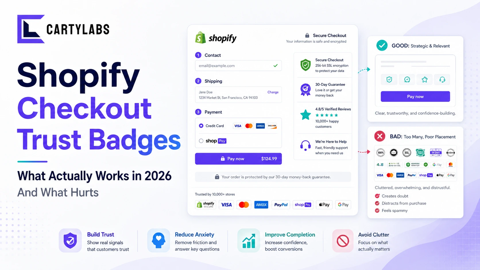
Shopify Checkout Trust Badges: What Actually Works in 2026 (And What Hurts)
The honest guide to Shopify checkout trust badges. Which ones lift conversion, which ones hurt it, where to place them, and how to add them on Shopify Standard, Advanced, and Plus.
How to Integrate Loyalty Rewards Directly Into Shopify Checkout
Surface Shopify loyalty rewards inside checkout with UI extensions, points balance widgets, and redemption flows that lift returning-buyer conversion four to nine percent on stores with mature programs.
In-Checkout Upsells: How to Boost Shopify Order Value in 2026
Add in-checkout upsells on Shopify that lift AOV without dragging conversion. Offer construction, placement, targeting, and the apps that ship the highest-converting in-checkout modules in 2026.
 Install Cart — Free