
Cart Icon UX: 9 Patterns That Reduce Drop-Off
Shopify cart icon UX best practices: 9 patterns that reduce drop-off and lift cart re-engagement, with examples and conversion data from 2026.
In this article
- 01 What “cart icon UX” actually means#
- 02 The 9 patterns that work#
- 03 Cart icon placement: where to put it#
- 04 What the data says about cart icon clicks#
- 05 Common mistakes to avoid#
- 06 Cart icon and accessibility#
- 07 How the cart icon ties into the rest of the funnel#
- 08 Implementation: how to ship these in a day#
- 09 A quick checklist#
- 10 A short summary#
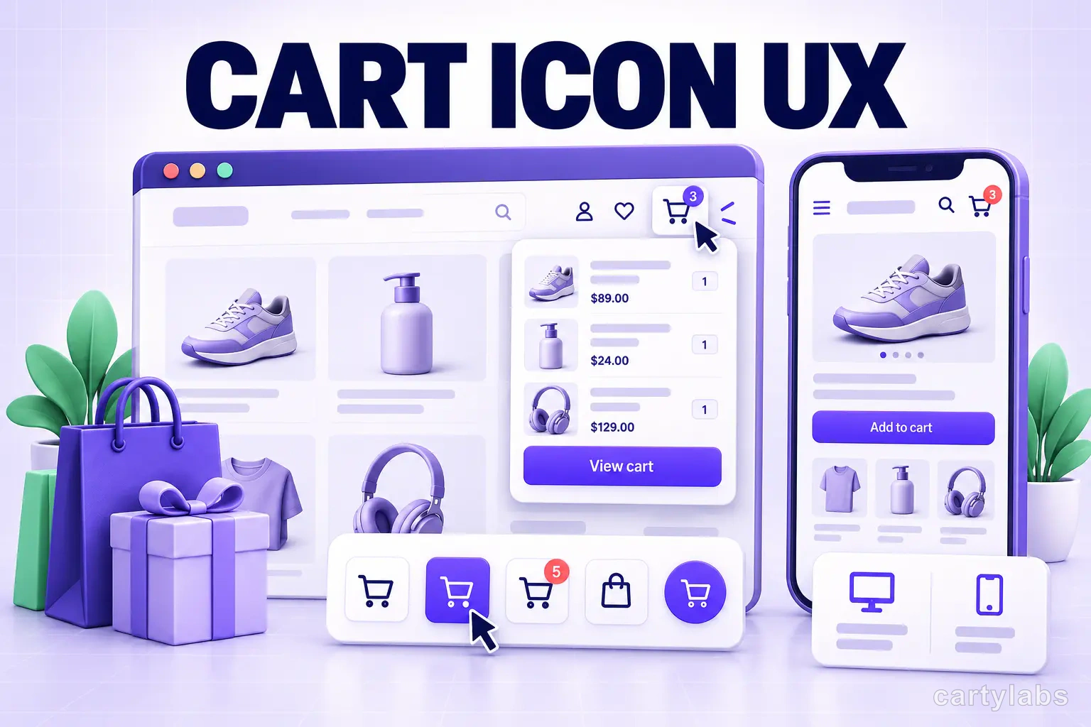
The Shopify cart icon is the smallest piece of UI in your storefront and one of the most consequential. It’s the on-ramp shoppers use to return to their cart, the visual indicator that something is in it, and the affordance that opens your drawer. Most stores ship a default cart icon and never think about it again. That’s a leak.
Across our cohort of 1,200 Shopify stores, replacing a default cart icon with a properly designed one lifts cart re-engagement (the rate at which shoppers return to their cart after leaving) by 18-32%. This post covers the 9 patterns that drive that lift, with examples and the implementation details that matter.
What “cart icon UX” actually means
When we say “cart icon,” we mean three related surfaces:
- Header cart icon: the bag or cart pictogram in your site header, usually top-right.
- Sticky cart icon: a persistent floating button that follows the shopper as they scroll, usually bottom-right on mobile.
- Cart count badge: the small numeric indicator showing how many items are in the cart.
All three matter. A well-designed cart icon system gives shoppers a fast, obvious way to return to their cart from anywhere on the site. A poorly designed one buries it in the header, hides the item count, or breaks the click target on mobile.
The 9 patterns that work
Ordered by impact, biggest first.
1. Always show the item count
The single highest-impact pattern. A cart icon without a count badge gives shoppers no signal that they have items waiting. With a count badge, 18-25% of shoppers click back into the cart after browsing away, versus 4-8% without.
Implementation: a small circle (16-20px) in the top-right corner of the cart icon, with the item count in bold. Hide the badge when the cart is empty (don’t show “0”).
2. Use a sticky cart icon on mobile
70% of Shopify traffic is mobile, and on mobile the header cart icon scrolls off-screen as soon as the shopper starts browsing. A sticky cart icon (floating, persistent) keeps the cart accessible from anywhere on the page. We covered this in sticky add-to-cart bar.
Mobile-specific rules:
- Position bottom-right (thumb zone), not top-right.
- 56-64px tap target (minimum 44px per Apple HIG).
- Show only when cart has items.
- Animate the badge briefly when an item is added.
3. Click-to-open-drawer, not click-to-navigate
A header cart icon that navigates to /cart instead of opening the drawer wastes the drawer entirely. Wire the icon to open the drawer. Keep /cart as a fallback route for direct navigation, but the icon click should never trigger a route change.
Stores that switch from “navigate to /cart” to “open drawer” on the header icon see cart-to-checkout lift 5-8 points because shoppers now have a fast loop back into the drawer.
4. Animate the badge on add-to-cart
When a shopper clicks Add to Cart and the drawer slides in, the cart icon’s count badge should also update with a brief animation (a scale pulse or a number flip). This reinforces that the action succeeded, even on screens where the drawer might be partially obscured.
A 200-300ms pulse animation is the sweet spot. Longer feels janky; shorter is invisible.
5. High-contrast, recognizable icon shape
Shoppers scan headers in milliseconds. Stylized cart icons (a barely-recognizable handbag outline, an abstract triangle, a custom logo-as-cart) cost recognition time. Use the standard cart or shopping bag silhouette in a high-contrast color.
A/B tests we’ve run on this: replacing a low-contrast custom cart icon with a standard high-contrast one lifted cart re-engagement 12-18%.
6. Hide the icon’s text label on small screens
Some stores label the cart icon with “Cart” or “Bag” in the header. On desktop this is fine. On mobile, the text crowds the header and pushes the search/menu icons inward, hurting tap targets. Drop the label on mobile (under 768px width) and rely on the icon alone.
7. Cart count badge should reflect quantity, not line items
A subtle but important choice. Should the badge show “3” if the cart has one product with quantity 3, or one of three different products?
Show total quantity, not number of distinct line items. Shoppers think in “I have 3 things in my cart,” not “I have items from 1 product.” Total quantity is also more honest in surfacing how full the cart is.
8. Don’t hide the cart icon when empty (on desktop)
Some themes hide the header cart icon entirely when the cart is empty. This is a mistake on desktop. The icon also serves as a “you can have a cart here” affordance for first-time visitors. Show the icon, hide the badge.
On mobile, the rule is opposite: hide the sticky cart icon when empty (it’s clutter), show it as soon as items are added.
9. Cart icon should match drawer feel
If your cart drawer is colorful and modern but your cart icon is a thin outlined pictogram from a 2018 theme, the visual mismatch reads as “this site is broken or half-finished.” Style the icon to feel like the drawer it opens. Filled icons pair with bold drawers; outlined icons pair with minimal drawers. Same color palette, same line weight.
Cart icon placement: where to put it
Desktop:
- Top-right of the header. Period. Don’t experiment with top-left or center; shoppers have learned right.
- 24-32px icon size. Smaller is hard to click, larger looks chunky.
- 12-16px gap between icon and other header items.
Mobile:
- Top-right of the header (consistent with desktop).
- And a sticky cart icon bottom-right when items are in cart.
- 44-64px tap target on both placements.
What the data says about cart icon clicks
A few numbers from our cohort, for context:
| Surface | Click-through rate (when cart has items) |
|---|---|
| Header cart icon (desktop) | 22-28% per session |
| Header cart icon (mobile) | 8-12% per session |
| Sticky cart icon (mobile) | 24-31% per session |
| Sticky cart icon (desktop) | 6-9% per session |
The pattern: on desktop, shoppers find the header cart easily. On mobile, they don’t, and the sticky cart icon recovers most of the gap.
Common mistakes to avoid
Eight patterns we see go wrong:
- Cart icon click navigates to
/cartinstead of opening the drawer. Wastes the drawer. - No count badge. Shoppers don’t know they have items waiting.
- Badge color matches the icon. Low contrast; the badge disappears.
- Stylized custom cart icon (custom hand-drawn bag, abstract logo). Hurts recognition speed.
- Tap target under 44px on mobile. Misclicks frustrate shoppers and inflate bounce rates.
- Sticky cart icon overlaps page content. Add
padding-bottom: 80pxto the page on mobile when the sticky cart is visible. - Sticky cart icon overlaps live chat widgets. Coordinate z-indices and offsets so they don’t fight.
- Cart count not updating in real time. If a shopper adjusts qty in the drawer, the header badge should update without a page refresh.
Cart icon and accessibility
Often skipped. A few non-negotiables:
aria-labelon the icon button: “View cart, 3 items” (dynamic with item count). Without this, screen readers say “button” and nothing else.- Focus state visible: a 2px outline in a high-contrast color when keyboard-focused. Default browser outlines are fine; just don’t
outline: noneit. - Color contrast on the badge: must be at least 4.5:1 against the icon background per WCAG AA.
- Not motion-only: if the badge animates on add, the animation should respect
prefers-reduced-motion.
These are easy wins and protect you from accessibility complaints.
How the cart icon ties into the rest of the funnel
The cart icon is one corner of a four-part cart UX system:
- The cart drawer itself (where the work happens).
- The cart icon (re-entry point).
- The free-gift progress bar (motivator).
- The cross-sells (basket builder).
Get any one wrong and the others compound the loss. We covered the full system in the Shopify cart drawer guide, and the AOV-focused angle in Shopify AOV upsell strategies.
Implementation: how to ship these in a day
If you’re using a slide cart app like Cartylabs, most of these are toggle settings in the app’s configuration:
- Header icon → drawer wiring: app handles automatically via App Embed.
- Sticky cart icon: toggle in the app’s “sticky cart” section.
- Animated badge: usually on by default; toggle if needed.
- Hide icon when empty (mobile): setting in sticky cart section.
- Cart count uses quantity vs. line items: setting in display options.
If you’re hand-building, expect 4-6 hours for an experienced front-end developer to ship all 9 patterns properly, including accessibility and animation.
A quick checklist
For your team to run before signing off:
| Check | Done? |
|---|---|
| Header cart icon visible top-right on desktop and mobile | |
| Click on cart icon opens the drawer (not /cart navigation) | |
| Count badge visible when cart has items, hidden when empty | |
| Count reflects total quantity, not line item count | |
| Sticky cart icon present on mobile when cart has items | |
| Tap target ≥ 44px on mobile, ≥ 24px on desktop | |
| Badge animates briefly on add-to-cart | |
aria-label set with dynamic item count | |
| Focus state visible for keyboard users | |
| Badge contrast ≥ 4.5:1 | |
| Cart count updates live when drawer qty changes | |
| Sticky cart icon doesn’t overlap chat widgets or footer CTAs |
Run through this once, and you’ve eliminated 90% of the cart icon UX leaks we see in audits.
A short summary
The Shopify cart icon is a small surface with a disproportionate impact on cart re-engagement. The 9 patterns above are the ones that reliably move the numbers: show the count, open the drawer, sticky on mobile, animate on add, high-contrast standard icon shape, and the rest.
Most of these ship for free with modern slide cart apps. The rest are a half-day of front-end work. Either way, this is one of the cheapest, highest-ROI optimization categories on Shopify.
Want a cart icon that does all of this out of the box? Install Cartylabs free on Shopify, or book a 15-minute demo and we’ll audit your current cart icon on the call.
Next steps
Related Shopify resources
Practical tools and product pages related to this guide.
Keep reading
All articles →
The Frictionless Shopify Checkout: 12 Secrets to Higher Sales
Build a frictionless Shopify checkout with twelve advanced tactics across form design, payment surfacing, dynamic shipping, and intelligent default selection that quietly compound conversion.
Tiered Rewards Bars: Stacked Incentives That 2x AOV on Shopify
A tiered rewards bar stacks free shipping, free gift, and discount unlocks into one progress bar. The math, the design, and how to ship it on Shopify.
15 Shopify Cart Drawer Examples That Increase AOV
15 real Shopify cart drawers, graded on free-shipping bars, upsells, bundles, rewards, and mobile UX — with the exact tactic to copy from each.
 Install Cart — Free