
Cartylabs Cart Drawer Compatibility with Shopify Themes
Cartylabs connects your Shopify theme's cart icon, add-to-cart buttons, and many product-card quick-add buttons to a smooth cart drawer.
In this article
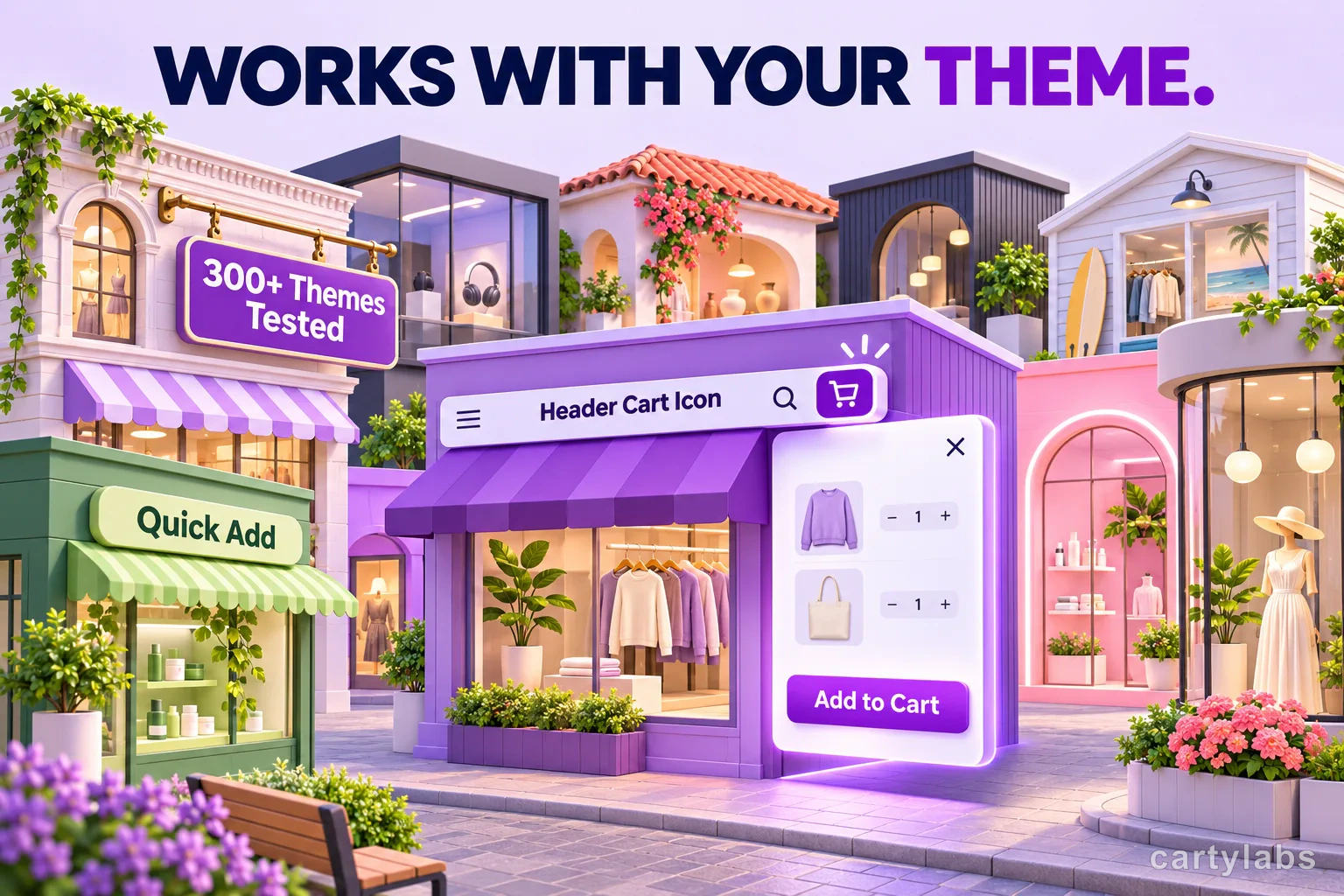
Give shoppers a faster path from product to checkout. With Cartylabs, the theme’s cart icon opens the Cartylabs drawer, and add to cart can add the item and open the drawer without sending shoppers to a new page. Quick add on product cards works across many Shopify Theme Store theme families too.
Cartylabs is tested against demo stores of more than 300 Shopify Theme Store themes. That broad coverage helps merchants bring a polished drawer to a wide range of storefront designs while keeping familiar shopping controls in place.
Keep the shopping flow moving
When a shopper clicks the theme’s cart icon, the Cartylabs drawer opens so they can review the cart and continue browsing or head to checkout. They do not have to leave the page just to see what is in their cart.
On product pages, an add-to-cart click can add the product and open the drawer in the same flow. On collection pages, quick add can do the same from a product card, letting shoppers keep browsing without a full-page detour. Cartylabs also handles familiar theme variations, including themes that open their own cart from a touch or hover interaction, to avoid showing two carts at once.
Quick add across product cards
Quick add lets a shopper put an item in the cart directly from a collection or product card. Cartylabs supports this behavior across many theme families, alongside the main product-page add button. That means shoppers can move from browsing to cart review with fewer interruptions.
This is especially useful for products with a straightforward choice, such as a bag offered in one size or a coffee blend with a default option. If a shopper needs to choose a size, color, or other option first, the theme can keep that selection step in its own flow. Once the shopper makes the choice, the cart experience can continue as expected.
When the theme should handle the interaction
If a shopper needs to choose a size or another option before adding, the theme keeps that selection step. The theme also keeps question or back-in-stock controls and buttons inside its own cart, so they continue to do their original job. These are the main cases where Cartylabs leaves the interaction to the theme rather than opening its drawer.
That handoff is useful for products where the choice is part of the purchase. A shopper buying a shirt should be able to pick a size before it enters the cart. A product card that opens a size picker can keep doing that, while a simple one-click item can go directly into the cart drawer. The goal is to preserve the theme’s useful product-selection experience and make cart review faster, not to skip a decision the shopper still needs to make.
If your theme needs a hand
First, make sure the Cartylabs app embed is enabled in your theme. Then try the header cart icon, a product page add-to-cart button, and quick add on a collection card, on both desktop and mobile.
If one of those controls does not open the Cartylabs drawer, Cartylabs includes a custom code setting for JavaScript and CSS to fine-tune the experience. The code stays within the app and does not modify your theme files. For help, contact Cartylabs through the in-app chat or email support@cartylabs.com with your theme name and the page where the issue appears.
A simple storefront check
Use a test or preview storefront and walk through these shopper journeys:
- Click the cart icon and confirm the Cartylabs drawer opens.
- Add an item from its product page and check that it appears in the drawer.
- Try quick add on a product card, including a product with options if your theme supports that flow.
- Repeat on mobile and confirm the theme’s own cart controls still behave normally.
These checks make it easy to confirm the most important parts of the shopping flow before publishing. If something needs adjusting, Cartylabs support can help you identify the next step.
Pay special attention to the mobile header and product cards. Many themes present a compact header on a phone, and shoppers may use a different cart icon there than on desktop. A quick-add button may also behave differently when a product has several options. Testing both views confirms that customers can open the cart and understand what happens after they add an item, whether they start from the product page or browse a collection.
The result is a cart experience that feels connected to the storefront: shoppers use the controls they already recognize, see the Cartylabs drawer at the right moment, and stay on the page while they shop. For more on drawer design, see the Shopify cart drawer guide. Compare included features on the Cartylabs pricing page.
Next steps
Related Shopify resources
Practical tools and product pages related to this guide.
Keep reading
All articles →
Shopify Sidekick Can Tune Your Cart Drawer, But It Won't Publish for You
Shopify Sidekick can suggest changes to supported Cartylabs cart settings, but you review and save them. See what it can tune and where it stops.
Payment Icons in Your Shopify Cart: Helpful Trust Signal or Clutter?
Shopify cart payment icons show shoppers which payment methods your store accepts. Learn how Cartylabs lets you choose, reorder, and display icons in the drawer.
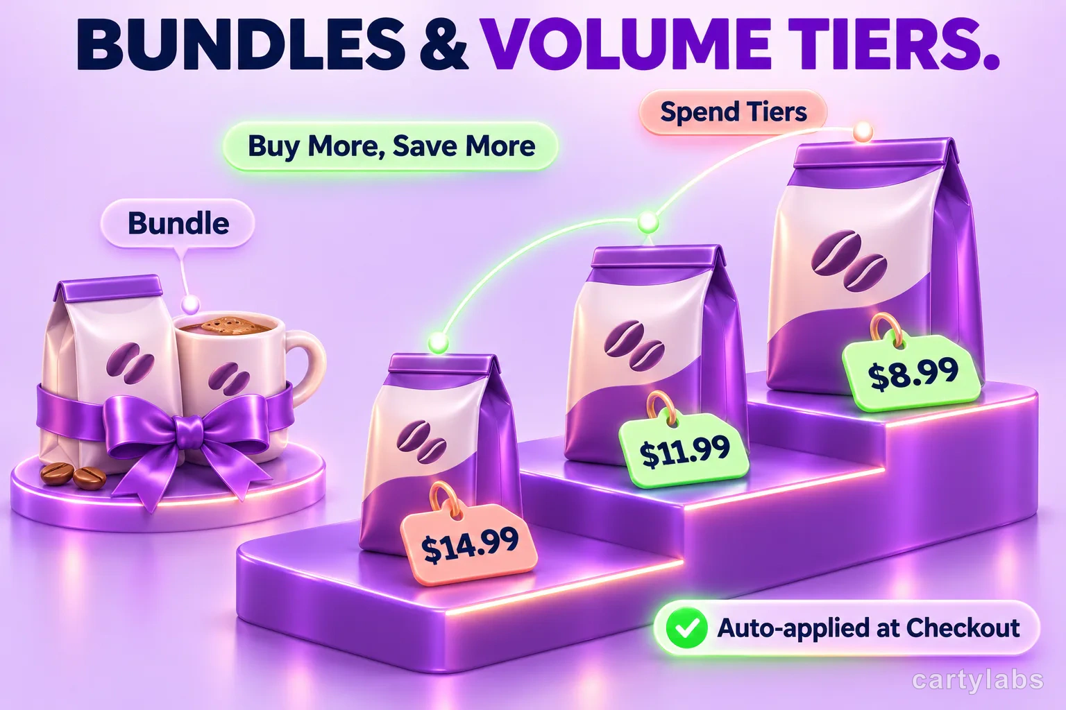
3 Shopify Cart Discount Types: Bundles, Volume, and Spend Tiers
Shopify cart discounts can reward bundles, product quantities, or cart spend. Learn how Cartylabs shows each offer in the cart and applies eligible savings at checkout.
 Install Cart — Free