Shopify Bundle Strategy: Optimizing Every Stage From Product Page to Post-Purchase
Optimize your Shopify bundle strategy at every stage, from product page placement to post-purchase upsells, with specific tactics that lift AOV at each step.
In this article
- 01 Stage 1: Product Page: How to Make the Bundle Offer Land#
- 02 Stage 2: Bundle Offer: How to Structure the Deal#
- 03 Stage 3: Cart Drawer: How to Hold the Purchase Decision#
- 04 Stage 4: Checkout: How to Convert Purchase Intent#
- 05 Stage 5: Thank-You Page: How to Extend the Journey#
- 06 Measuring the complete bundle customer journey#
- 07 Frequently Asked Questions#
Most Shopify bundle guides stop at the product page. They walk you through how to configure the offer, set the discount, and display the widget. Then they call it done with a screenshot.
The problem is that a bundle is not a product feature. It is a customer journey. And that journey extends through the cart, through checkout, and onto the thank-you page. At every stage, the experience either reinforces the purchase decision the shopper made on the product page or it quietly undermines it.
This guide follows the complete Shopify bundle journey across five stages. Each stage has specific jobs it needs to do, specific failure modes to avoid, and specific fixes that move conversion.
Stage 1: Product Page: How to Make the Bundle Offer Land
The product page is where the bundle journey begins. It is the moment a shopper sees the offer, evaluates the value, and decides whether to engage. Most operators get this stage reasonably right, but several common mistakes leak conversion before the journey even starts.
Placement above the fold is non-negotiable
A bundle offer buried below the fold, tucked under a long product description, or stacked below dozens of reviews, is functionally invisible. Shoppers who do not see the bundle offer never make the decision to take it. The rule is simple: if the bundle is not visible alongside the primary add-to-cart button when the page loads, a significant share of your potential bundle buyers will never know it exists.
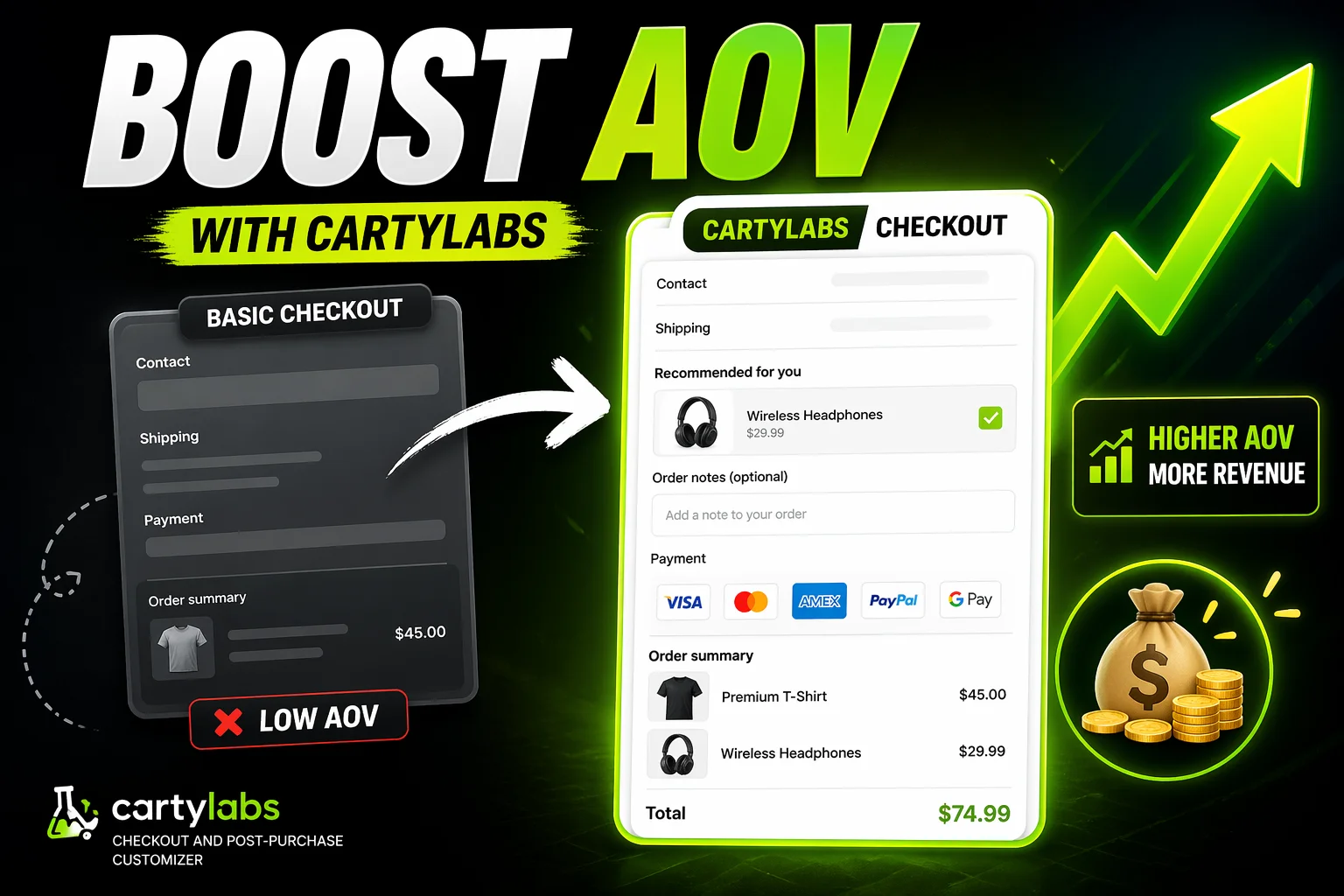
The correct placement is a dedicated section directly below the main add-to-cart area. It should show the included products visually, display the savings in both percentage and dollar terms, and include a single clear button labeled something like “Add bundle to cart.” The savings amount should be the most visually prominent text in that section.
Social proof closes the gap between interest and action
If your main product has 2,000 reviews but the bundle widget only shows product images with no review data, there is a trust gap at exactly the wrong moment. A shopper being asked to spend two or three times more than a single item purchase wants some evidence that other people bought this combination and were happy with it.
Even a brief social proof element closes this gap effectively. “500 customers have bought this set” or a label reading “Our number one starter pack” above the bundle widget adds the confidence that moves a hesitant shopper toward the add to cart button.
One bundle offer per page, displayed with clarity
Some stores place four different bundle options on a single product page: “Buy 2 and save 5%,” “Buy 3 and save 10%,” “The Starter Kit for $X,” and “Mix and Match any 5 for $Y.” The result is decision fatigue, and the response to decision fatigue is no decision at all. Shoppers presented with too many simultaneous bundle options frequently choose none of them.
Show one primary bundle offer per page, positioned clearly, without competing with other bundle variants for the shopper’s attention. Test different offers sequentially rather than presenting all of them at once.
Stage 2: Bundle Offer: How to Structure the Deal
The bundle offer itself is a combination of a pricing decision and a framing decision. What goes into the bundle, how much it costs, and how the value is described all determine whether the offer feels compelling or forgettable.
Name bundles around the outcome, not the product list
Weak bundle naming describes the contents: “Bundle A: Product 1, Product 2, and Product 3.”
Strong bundle naming describes the result: “Starter Kit: Everything you need for your first week” or “Complete Routine: The full system for clearer skin in 30 days.”
Outcome framing tells shoppers why this combination exists and what it will do for them. Product-list framing just describes inventory. Outcome frames convert better because they answer the question the shopper is actually asking, which is not “what is in this bundle” but “why should I buy all of this together.”
Price the bundle where it feels like a deal without giving away the business
The instinct in setting bundle pricing is to minimize the discount to protect margin. The market reality is that shoppers have a calibrated sense of what a “deal” feels like in their shopping category. In most consumer categories, a bundle discount needs to be 10 to 18 percent to feel genuinely meaningful. Below 10 percent, too many shoppers decide they would rather buy items individually as they need them. Above 20 percent, you risk training a segment of shoppers to never buy anything at full price.
For categories with higher average prices like skincare, supplements, and fitness equipment, a smaller percentage discount still represents meaningful dollar savings. “Save $45 on the Complete Kit” resonates more strongly than “Save 7.5%.” Use dollar savings framing when the absolute number is impressive. Use percentage framing when the percentage is more compelling.
Solve the variant selection problem
If your bundle includes items with multiple variants such as sizes, colors, or flavors, the variant selection experience matters enormously. A bundle that requires a shopper to navigate three separate dropdown menus to configure their options creates friction that erodes conversion even when the shopper genuinely wants the bundle.
CartyLabs handles both bundle creation and cart optimization in one app, with flexible variant selection, clean cart representation, and discount attribution that carries through to checkout without any gaps in the experience.
Stage 3: Cart Drawer: How to Hold the Purchase Decision
The cart drawer is where bundle conversions are most often lost. The shopper made their decision on the product page. The cart drawer’s job is to hold that decision and move the shopper toward checkout without introducing any new reasons to hesitate.
Three things the cart drawer must do for every bundle buyer.
Confirm the discount within seconds of the add
Within two seconds of the bundle landing in the cart, the shopper needs visible confirmation that the discount is applying. A savings callout in the subtotal section reading “Bundle savings: $12.00 off” or “You saved $12 on your bundle” serves this function directly. Without it, shoppers who were excited about the deal on the product page start to wonder if the discount followed them into the cart, and that uncertainty breaks momentum.
Keep the cart layout clean with multiple line items
Three or four line items in a cart drawer designed for single-item orders creates visual noise that the shopper’s brain reads as complexity. Use a cart app that keeps multi-item displays clean with consistent thumbnail sizes, compact variant labels, and clear product names that do not wrap across multiple lines. The cart should look like a well-designed interface, not a disorganized receipt.
Show one highly relevant upsell, nothing more
A single upsell that complements the bundle feels helpful. Multiple upsells stacked below a multi-item bundle send the signal that the store is prioritizing sales volume over the shopper’s checkout experience. The test for whether an upsell belongs: would you confidently recommend this item to a friend who just bought this exact bundle? If not, do not show it.
Good upsells for bundle buyers are obvious accessories the bundle does not include, refill sizes for consumable items in the bundle, or small “complete the experience” items like a carrying case or complementary tool. Poor upsells are a second bundle, a high-ticket item from an unrelated category, or anything requiring more than two seconds to explain the relevance.
The free shipping progress bar belongs here too. Set the threshold 10 to 15 percent above your average post-bundle cart value. Showing a bundle buyer they are $7 from free shipping at this stage of high commitment almost always results in one more item added.
Stage 4: Checkout: How to Convert Purchase Intent
The Shopify checkout page is where purchase intent converts to completed revenue. For bundle buyers, specific mechanics make a meaningful difference in checkout completion rates.
Keep savings visible in the order summary
The order summary at checkout should clearly reflect the bundle discount. “Bundle discount: $12.00 off” in the line-item breakdown confirms to the shopper that the deal they committed to on the product page is real and intact.
This matters more than it might seem. Many Shopify themes show the discounted total without calling out the savings specifically. The shopper then needs to do mental math to verify the discount is there. Requiring that arithmetic at the payment step creates unnecessary hesitation. Remove the math requirement by surfacing the savings explicitly.
Add trust signals at the payment step for bundle buyers
Shopify checkout extensions let you inject content directly into the checkout page without modifying theme code. For bundle buyers, the three most effective trust signals are a return policy summary (“Not happy? Free returns within 30 days,” which addresses the risk of buying a multi-item kit and finding one item does not work), one strong social proof element (“Loved by 8,500 customers” near the payment button), and a security indicator such as a padlock badge or payment method logos.
CartyLabs supports all three with a no-code interface directly in the Shopify checkout editor.
Match the checkout format to the bundle buyer’s mental state
Bundle buyers are already spending more than they originally planned. Every additional checkout form step or page load adds friction at a moment when the shopper is already managing a larger-than-expected commitment. Shopify’s default one-page checkout format (available post-2023) is meaningfully better for bundle conversion than multi-step flows because it keeps all required fields visible and completable in a single scroll.
For one-page vs. multi-step checkout analysis, the short version for bundle buyers is: minimize the number of screens between cart and confirmation.
Stage 5: Thank-You Page: How to Extend the Journey
The Shopify order status page (formerly the thank-you page) is underutilized by most stores and particularly underused for bundle-specific follow-up.
The post-purchase upsell for bundle buyers
After the order confirmation fires, the customer’s payment method is on file, shipping is already committed, and the customer is at their peak satisfaction with the brand. A one-click post-purchase upsell that adds to the order they just completed converts 5 to 12 percent of buyers at near-zero friction.
For bundle buyers, the strongest post-purchase offer is the item they almost chose. If they bought the Starter Kit containing products A, B, and C, and you know from your data that customers who buy that kit frequently return for product D within 30 days, show product D with a “Complete your routine” framing and a one-click add button. You know exactly what they bought and exactly what logical next step exists.
The second strong angle is subscription. If any item in the bundle is a consumable, the moment immediately after purchase is the ideal time to offer a subscribe-and-save: “Never run out. Subscribe to your cleanser and save 15% on every order.” The customer just demonstrated they value this product enough to include it in a bundle purchase. The conversion from that demonstrated preference to a subscription is a natural next step with significant lifetime value implications.
Review and social sharing prompts
A customer who just bought a bundle they are excited about is substantially more likely to leave a review than a customer who bought a single item with minimal emotional investment. The thank-you page is the right moment to ask. A simple prompt like “Excited about your Starter Kit? Leave us a review in 30 seconds” with a one-click link to your review platform captures review volume that directly supports future bundle social proof.
Measuring the complete bundle customer journey
Measuring only AOV gives an incomplete picture of bundle performance. A store could lift AOV and simultaneously raise cart abandonment, resulting in flat or declining revenue per visitor. The complete measurement framework looks at each stage independently.
| Metric | What it tells you | Where to find it |
|---|---|---|
| Bundle attach rate | What share of shoppers who see the offer take it | Bundle app analytics |
| Bundle cart abandonment rate | Where the funnel breaks after the add | Shopify checkout funnel report |
| Bundle purchase rate | End-to-end conversion from offer view to completed purchase | GA4 or Shopify analytics |
| Post-purchase conversion rate | How often bundle buyers take the follow-on offer | Post-purchase app analytics |
| Revenue per visitor for bundle sessions | The true economic performance of the bundle program | GA4 event tracking |
A high bundle attach rate paired with high bundle cart abandonment means the offer is working and the funnel is not. A low attach rate with a high cart-to-purchase conversion rate means the funnel is solid and the offer needs work. Track both to know which problem you are actually solving.
Each stage optimized in sequence builds a funnel where the economics compound. The best bundle programs on Shopify are not the ones with the biggest discounts or the most bundle SKUs. They are the ones where every handoff in the customer journey works cleanly from the product page to the thank-you page.
Frequently Asked Questions
What should a Shopify bundle look like on the product page?
A Shopify bundle on the product page should appear above the fold, directly below or beside the primary add-to-cart button. It should show the included products visually, state the combined savings in both percentage and dollar terms, and include a single clear “Add bundle to cart” button. Bundles placed below the fold or buried under product descriptions see dramatically lower attach rates than those placed at the top of the page.
How do I optimize the Shopify cart drawer for bundle buyers?
For bundle buyers, the cart drawer needs to do four things: show the bundle discount explicitly in the cart subtotal; keep line items clean and scannable even with three or four items in the cart; load a free shipping progress bar immediately after the bundle is added; and show one highly relevant upsell at most. Missing discount confirmation and visual clutter are the two fastest paths to losing bundle buyers at the cart stage.
What should I put on the Shopify thank-you page for bundle buyers?
The most effective thank-you page for bundle buyers includes a one-click post-purchase upsell for the natural next item after their bundle, a subscribe-and-save offer for any consumable in the bundle, and a review prompt. Keep post-purchase offers to one at a time. Presenting multiple options immediately after checkout creates decision fatigue when the customer is in a satisfied, low-effort state.
How do I name Shopify bundles to increase conversion?
Name bundles around outcomes rather than product lists. “Starter Kit: Everything you need for your first week” converts better than “Bundle A: Product 1, Product 2, Product 3.” Outcome names tell the shopper why the combination exists and what result it delivers. Product-list names describe inventory and require the shopper to do the mental work of understanding why these items belong together. Pair the outcome name with a clear savings callout and the bundle reads as expert curation rather than a promotional mechanic.
Keep reading
All articles →Micro-Copy, Mega Results: Writing Better Shopify Checkout Text
Master Shopify checkout micro-copy with specific examples for button labels, error messages, field hints, trust lines, and Thank You page text that quietly lifts conversion two to five percent.
How to Integrate Loyalty Rewards Directly Into Shopify Checkout
Surface Shopify loyalty rewards inside checkout with UI extensions, points balance widgets, and redemption flows that lift returning-buyer conversion four to nine percent on stores with mature programs.
How to Increase Average Order Value on Shopify: The Complete 2026 AOV Playbook
The 2026 Shopify AOV playbook covering every lever that lifts average order value, from bundles and upsells to checkout extensions, with a prioritized plan.